 Interactive
 Branding
 Print
Print
 Say hi
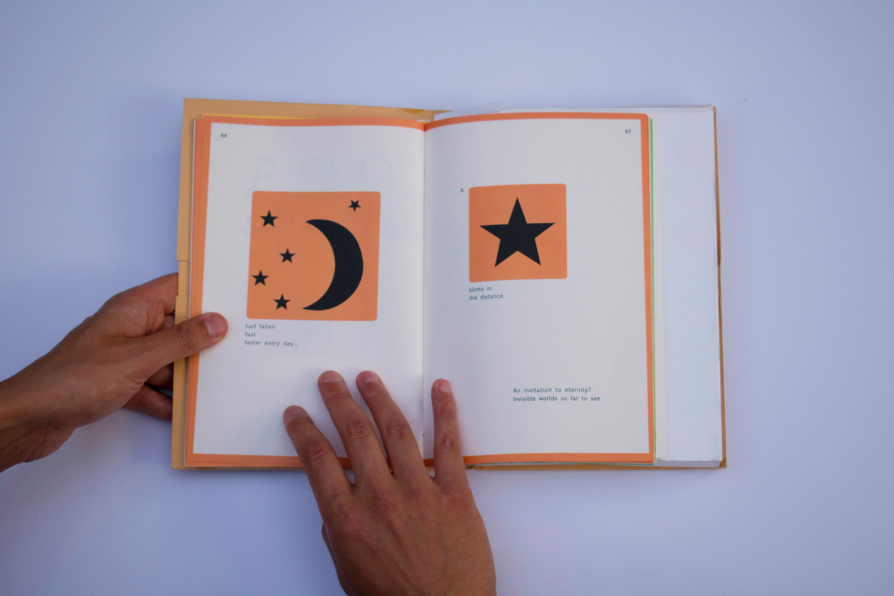
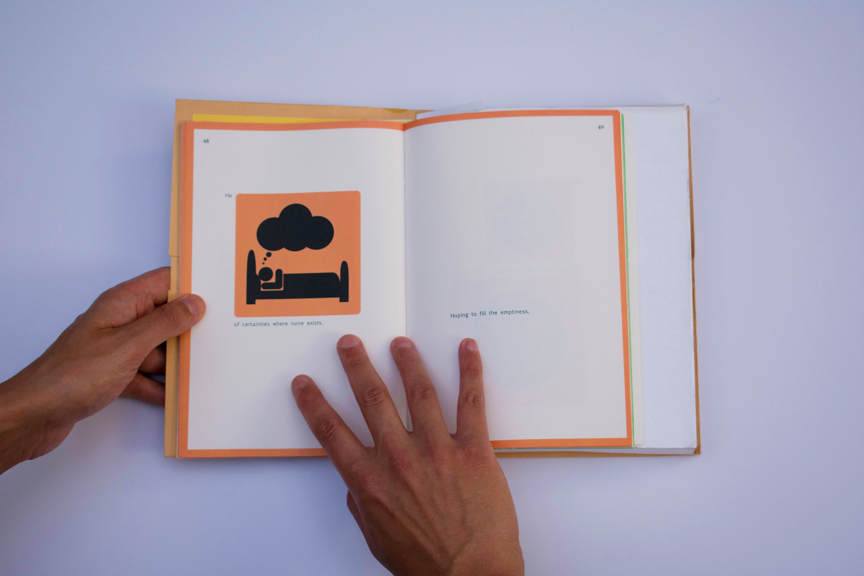
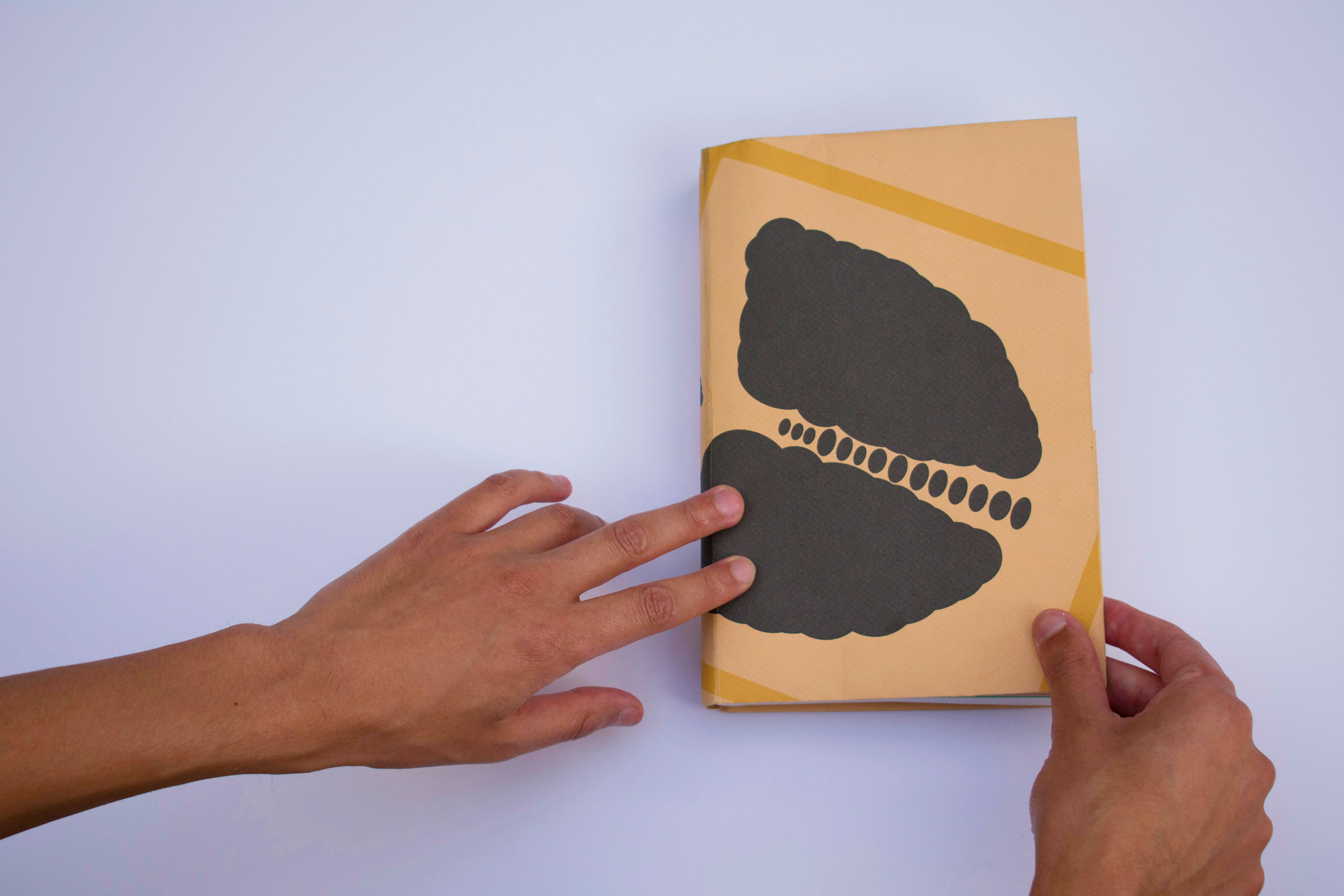
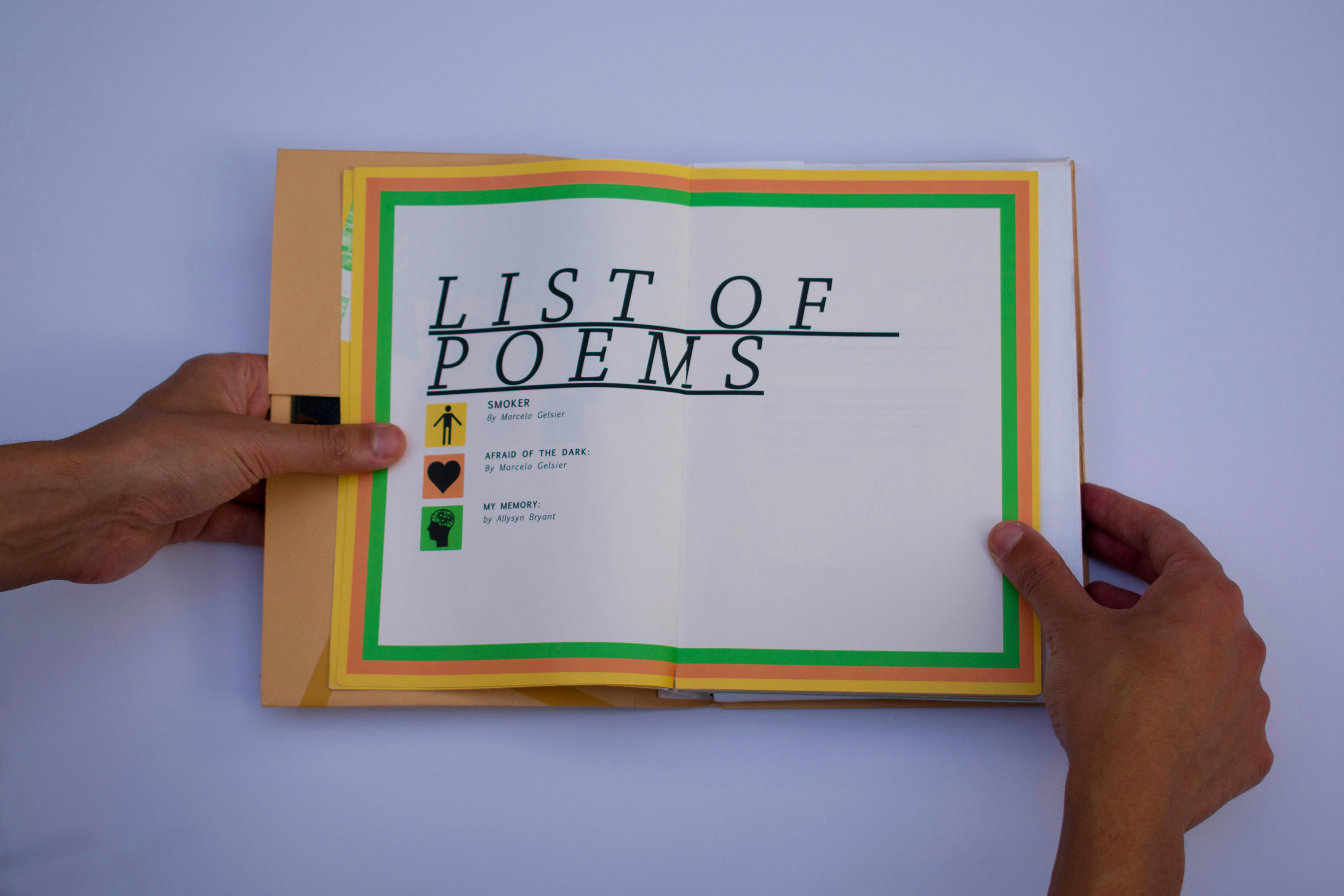
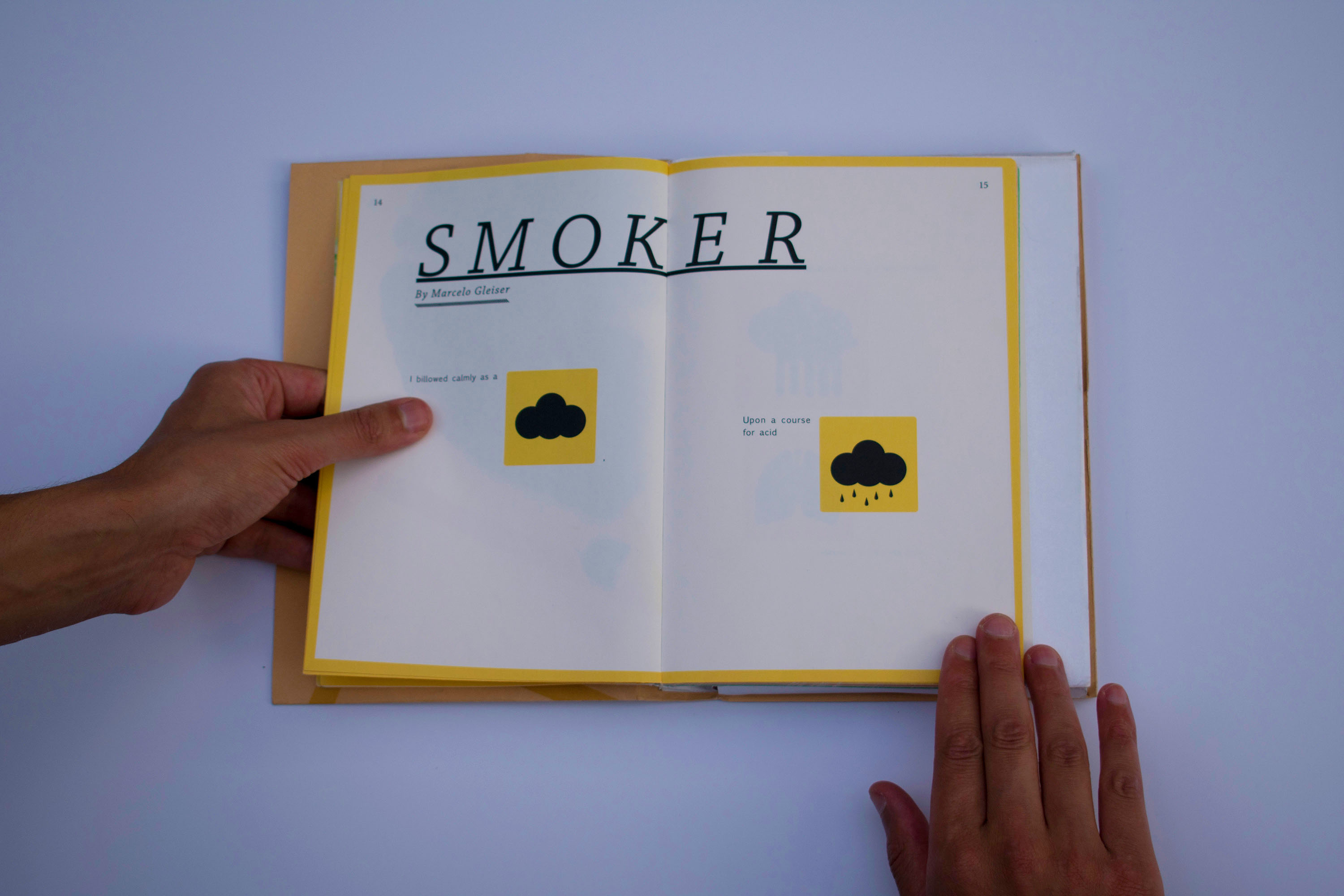
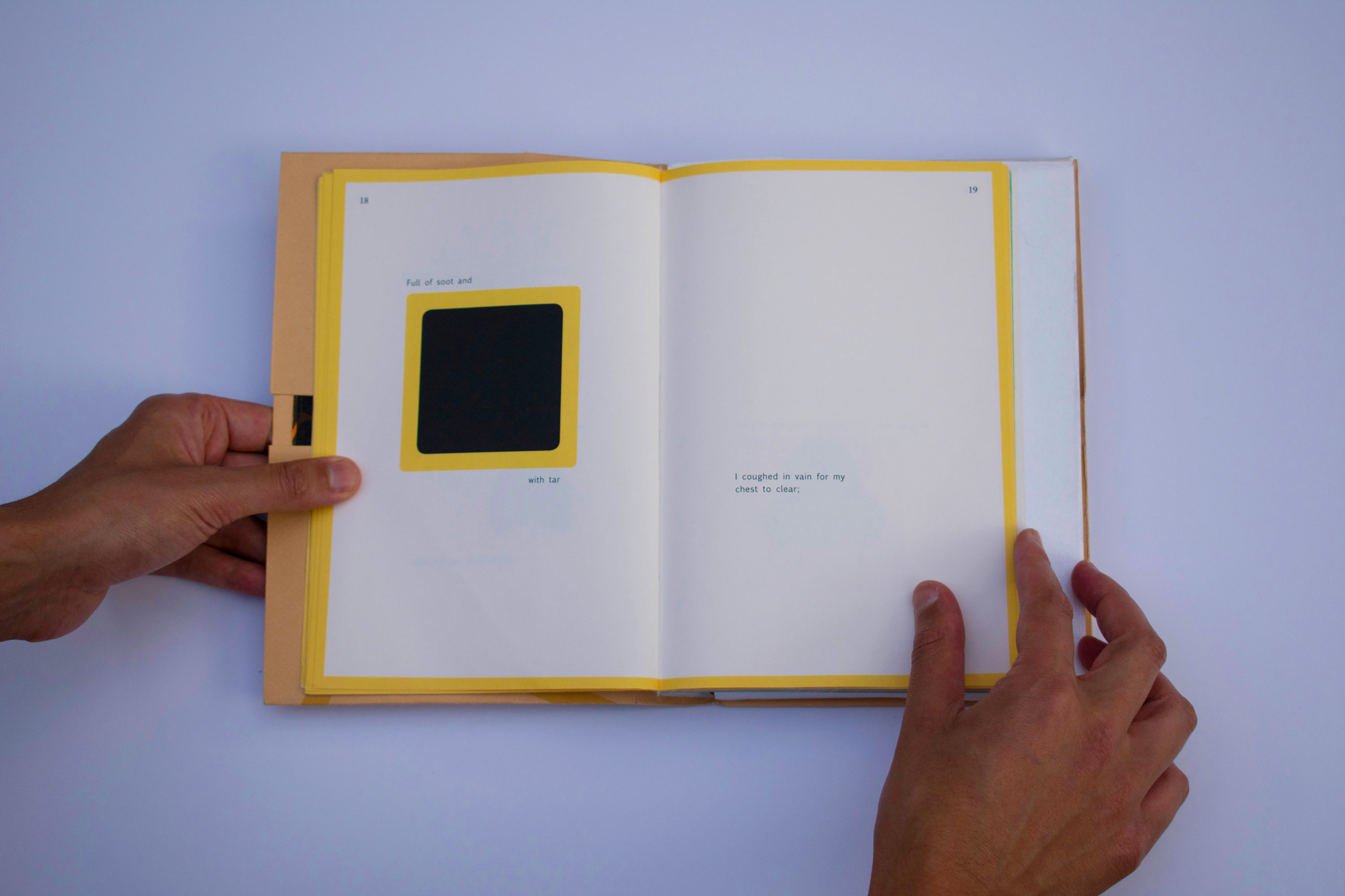
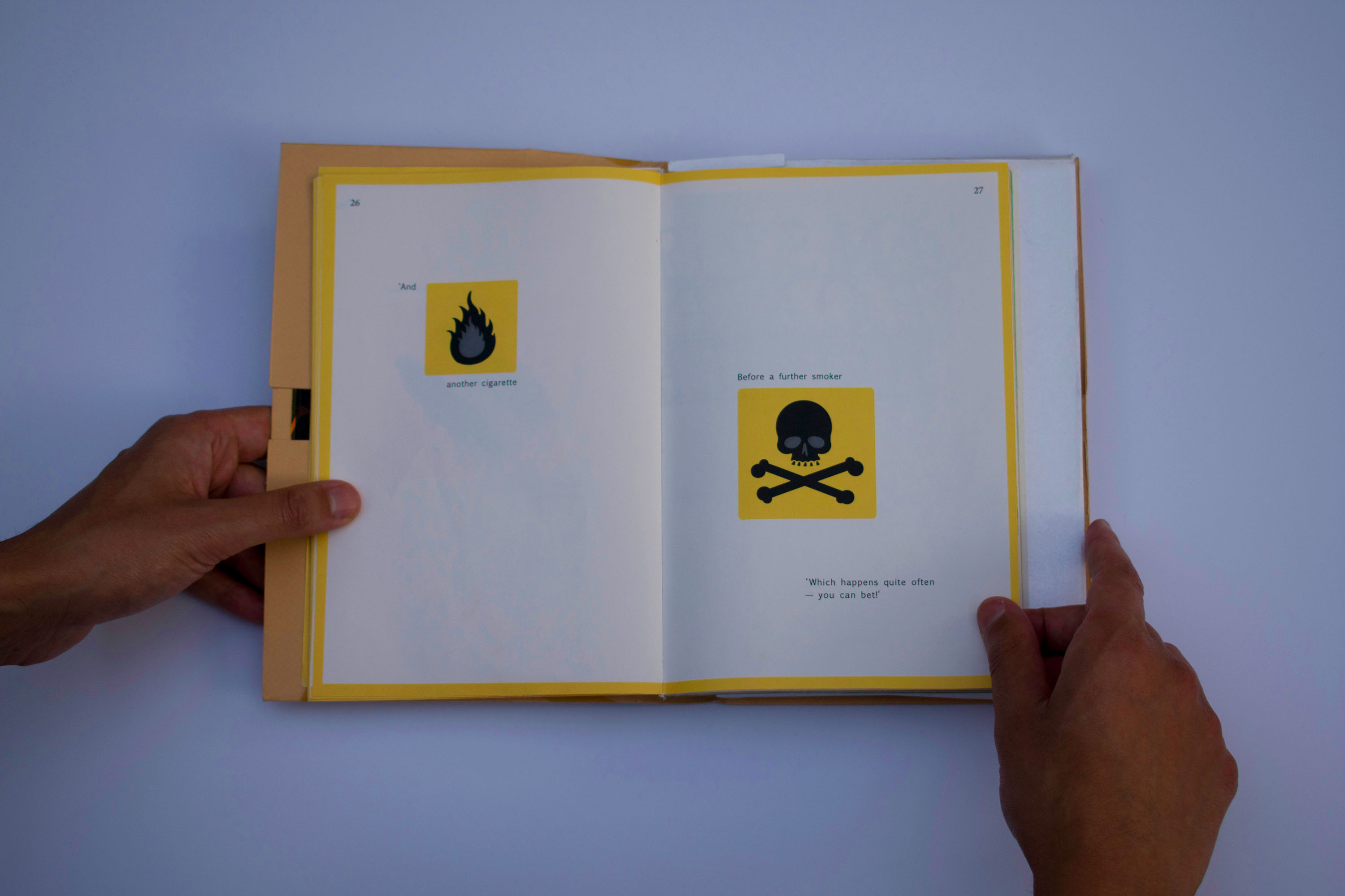
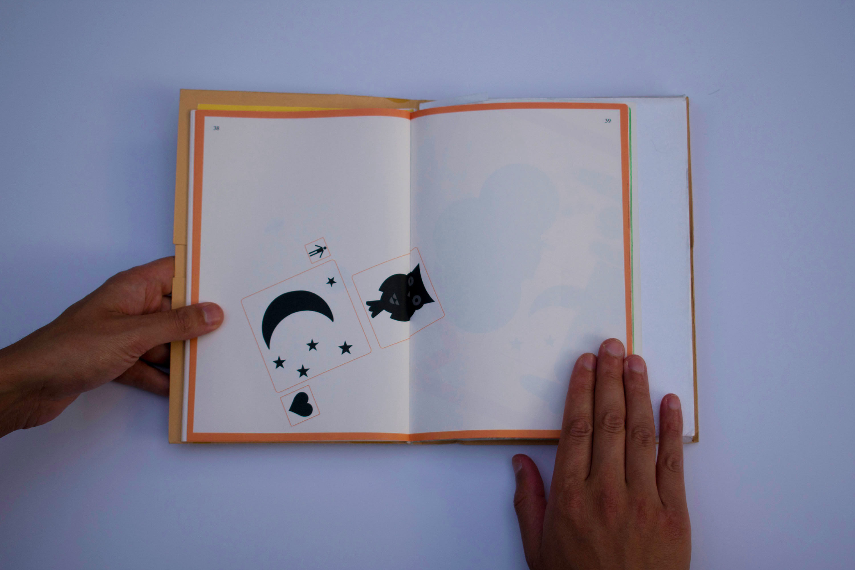
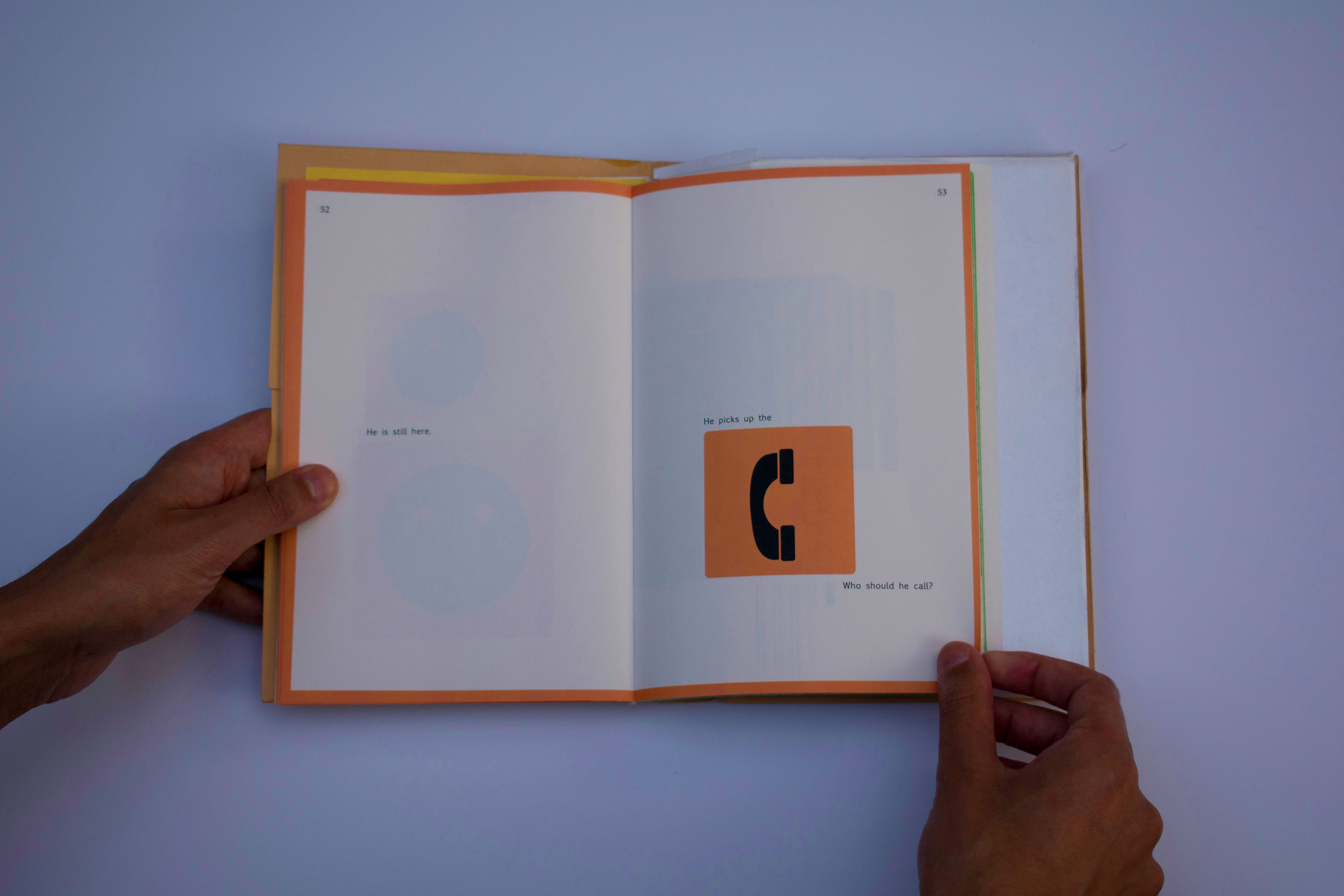
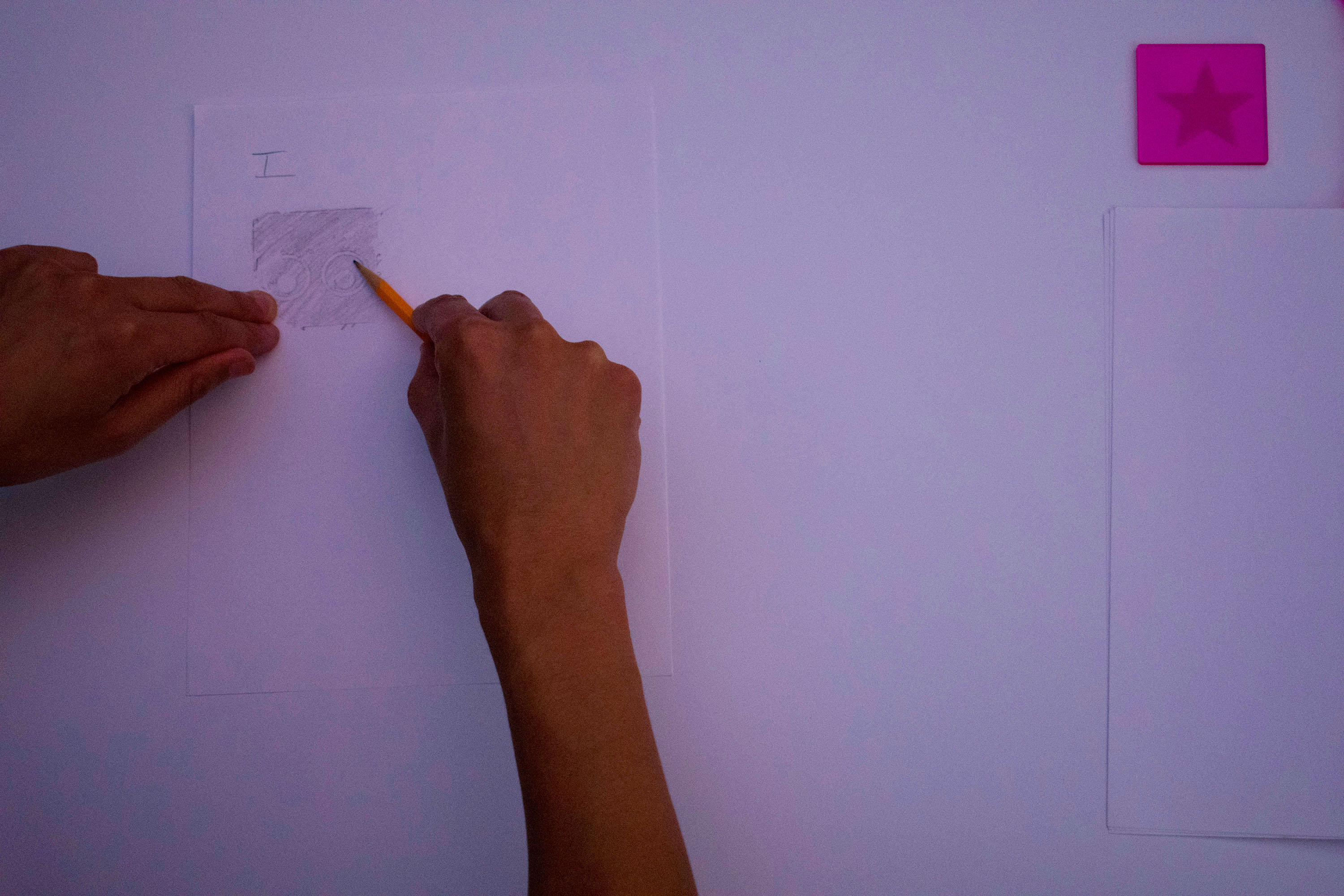
PICTO POETRY | 2013
Print, Iconography, Typography, Bookmaking, Lasercutting
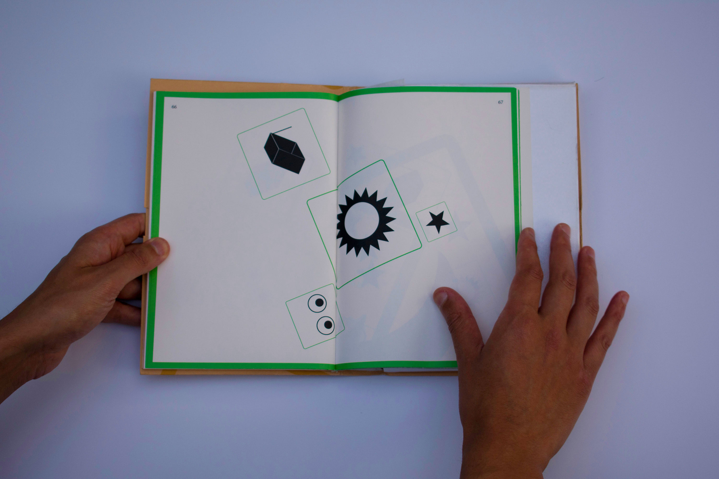
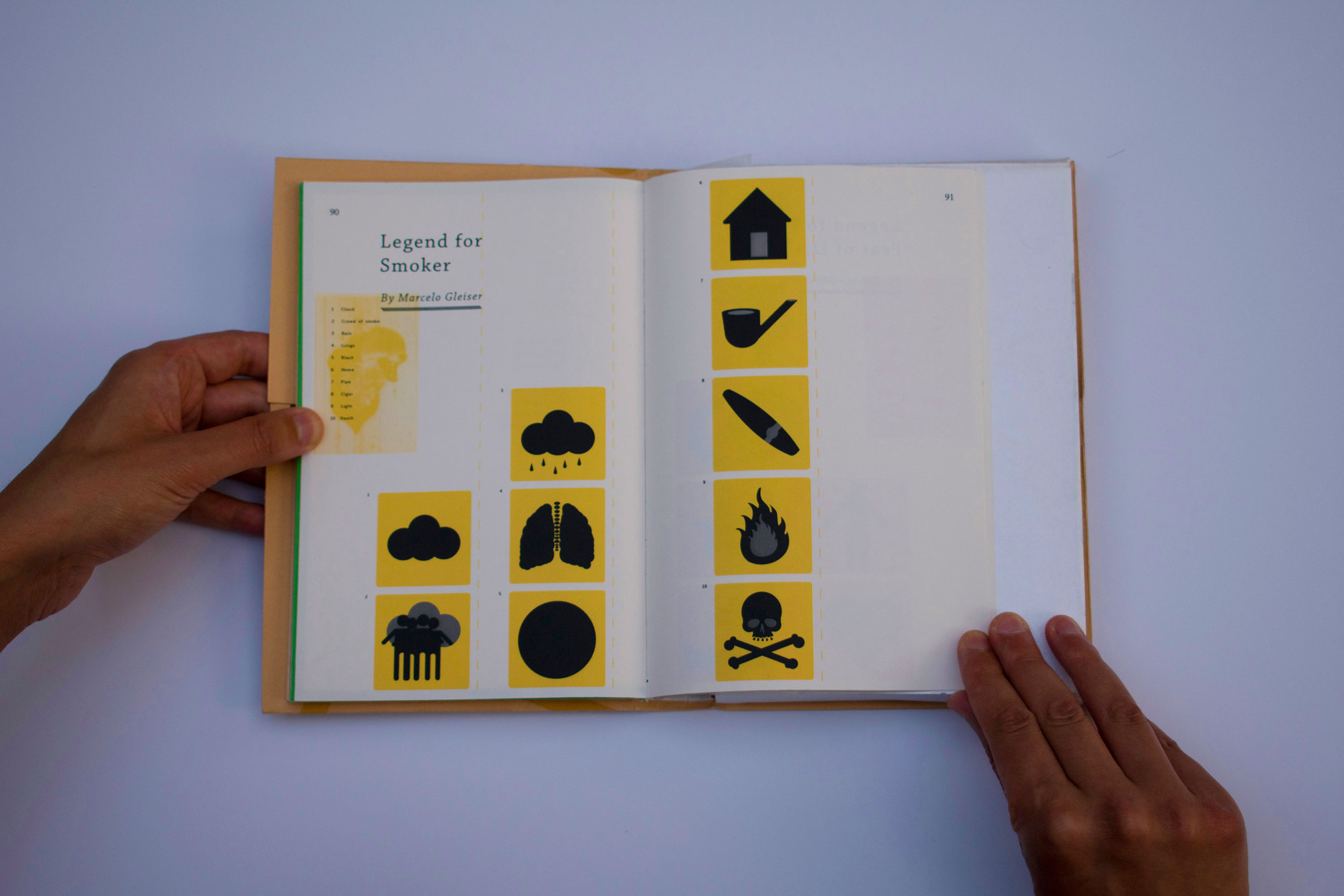
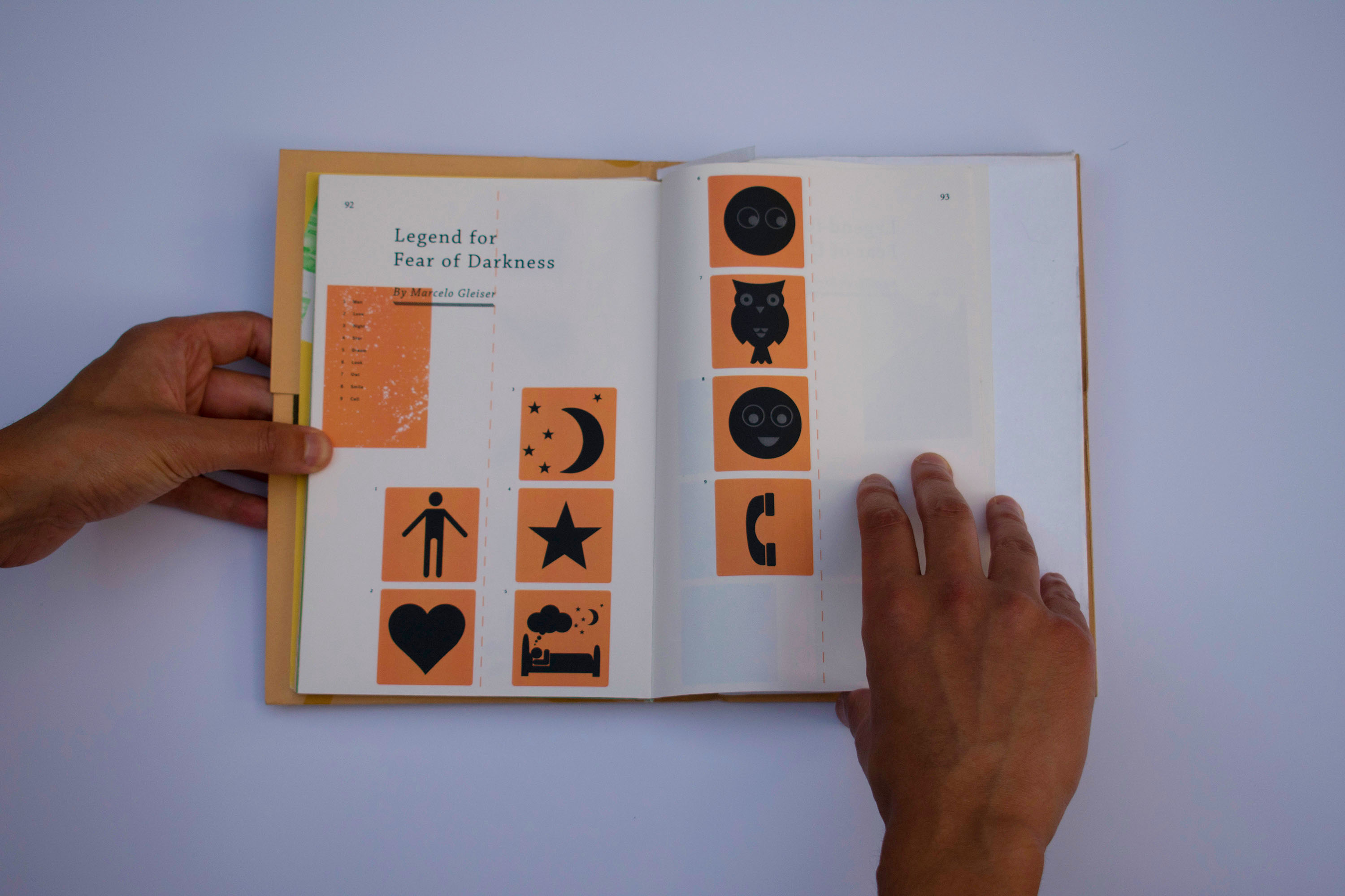
A book made of over 25+ custom made pictograms inspired by studying the history of Isotypes by Otto Neurath.
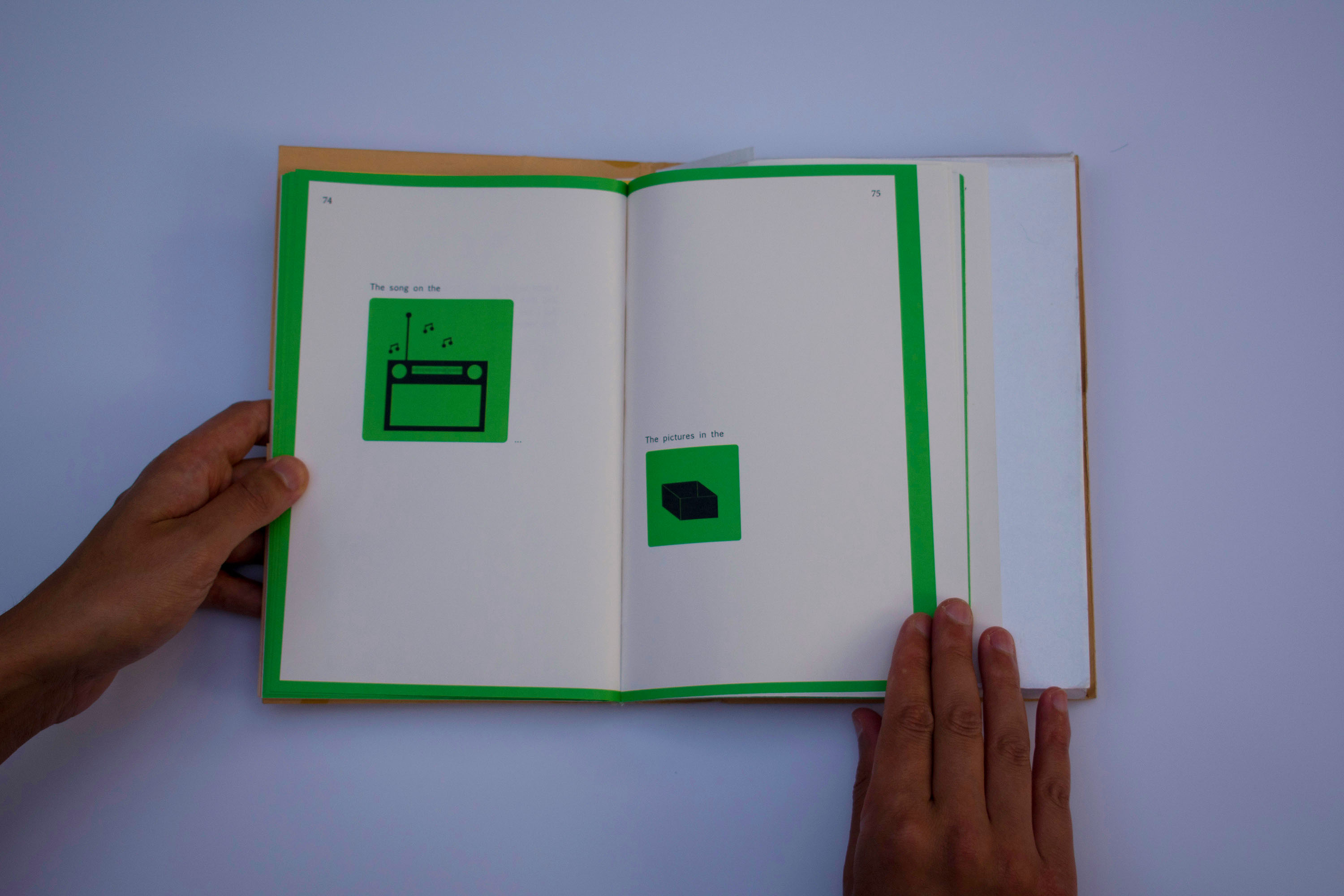
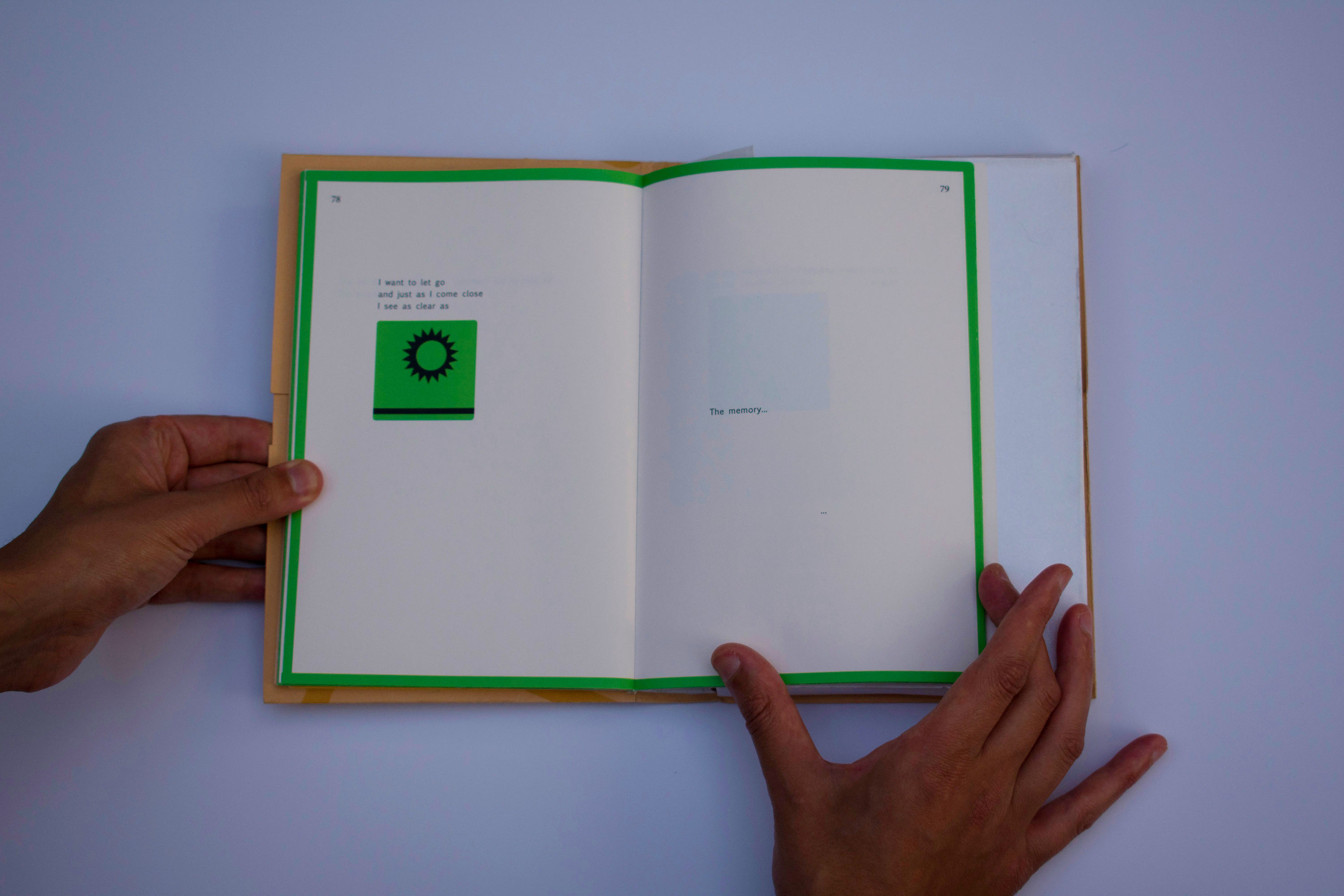
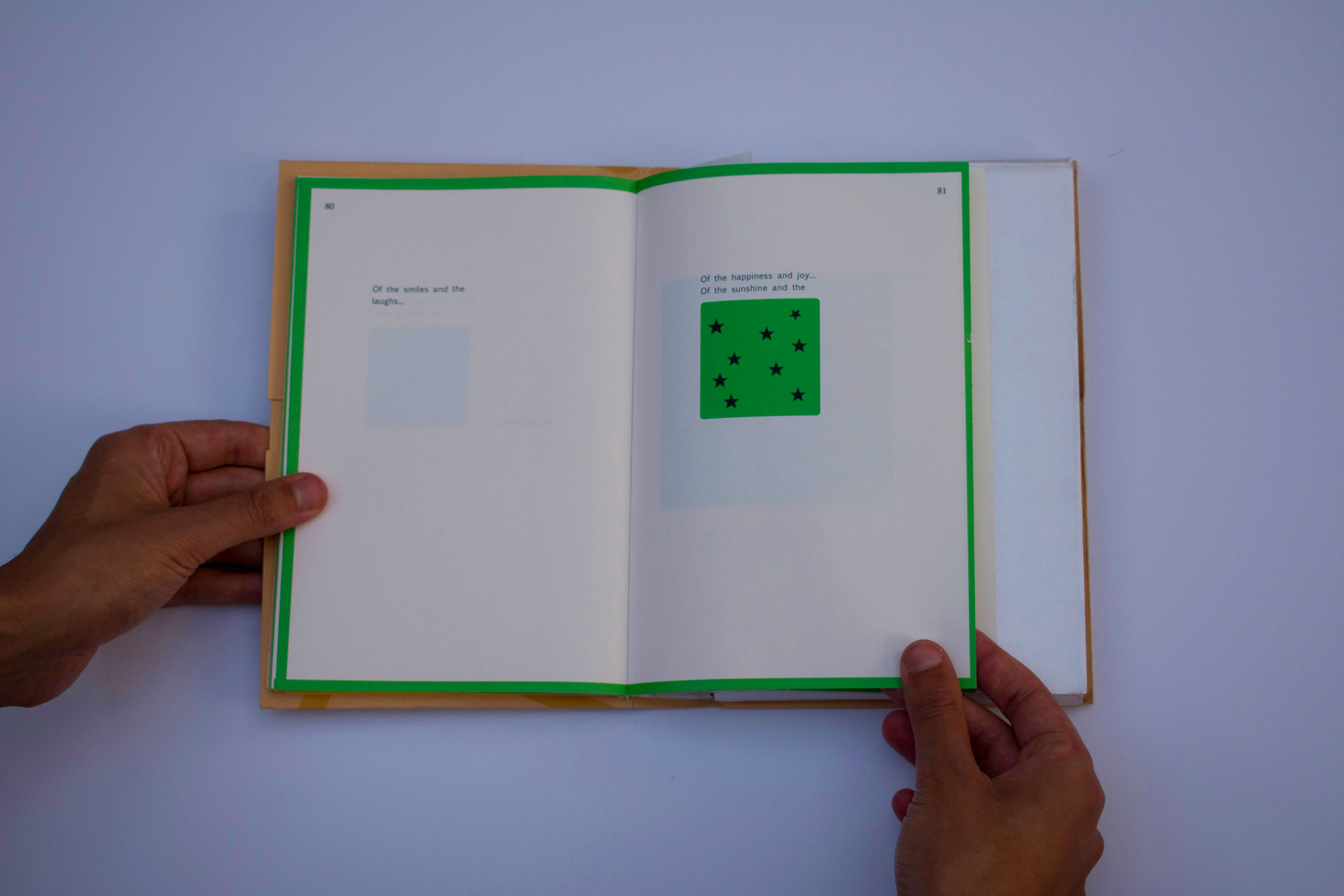
The book is 3 poems told 90% visually via pictograms, and 10% words.

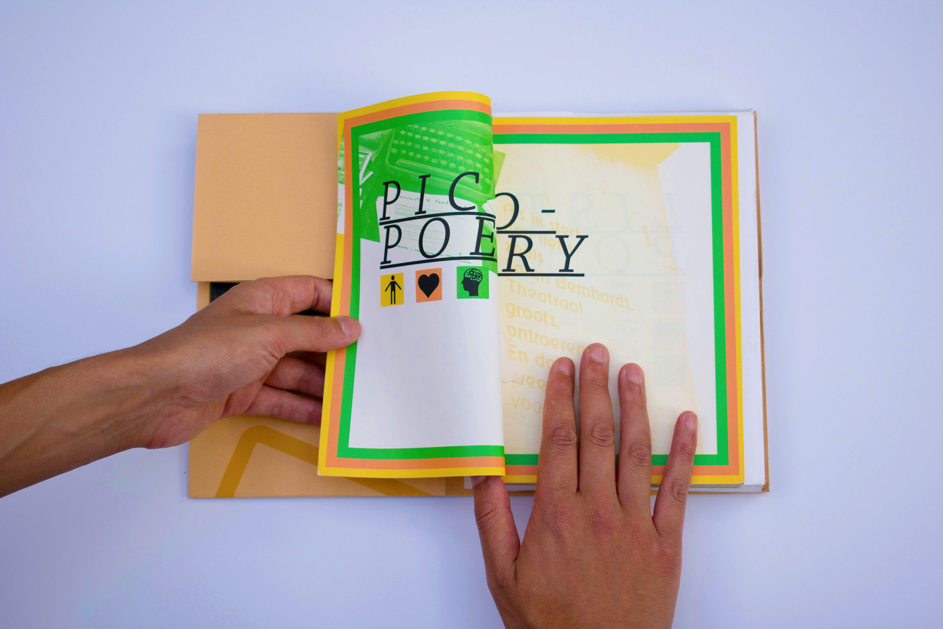
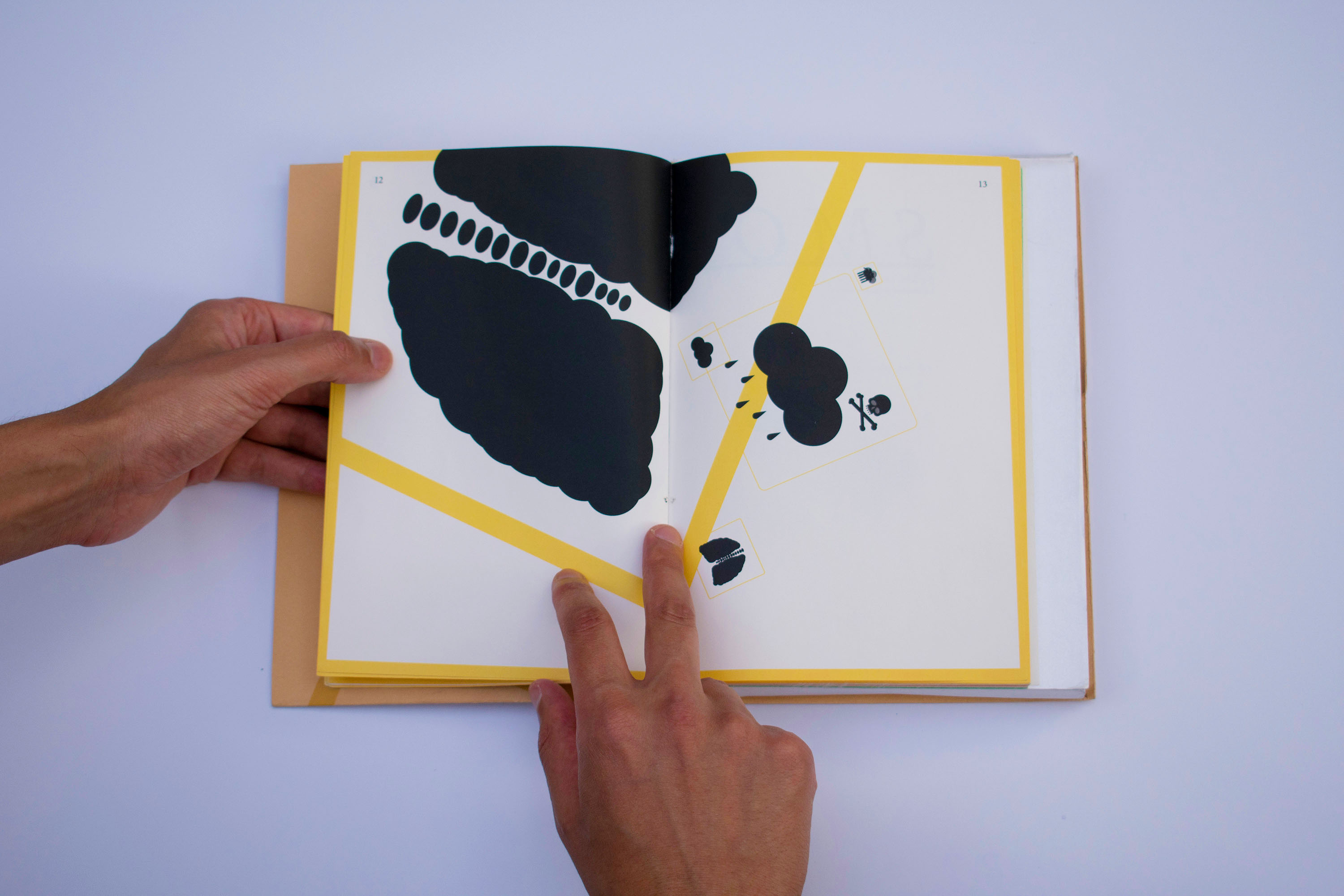

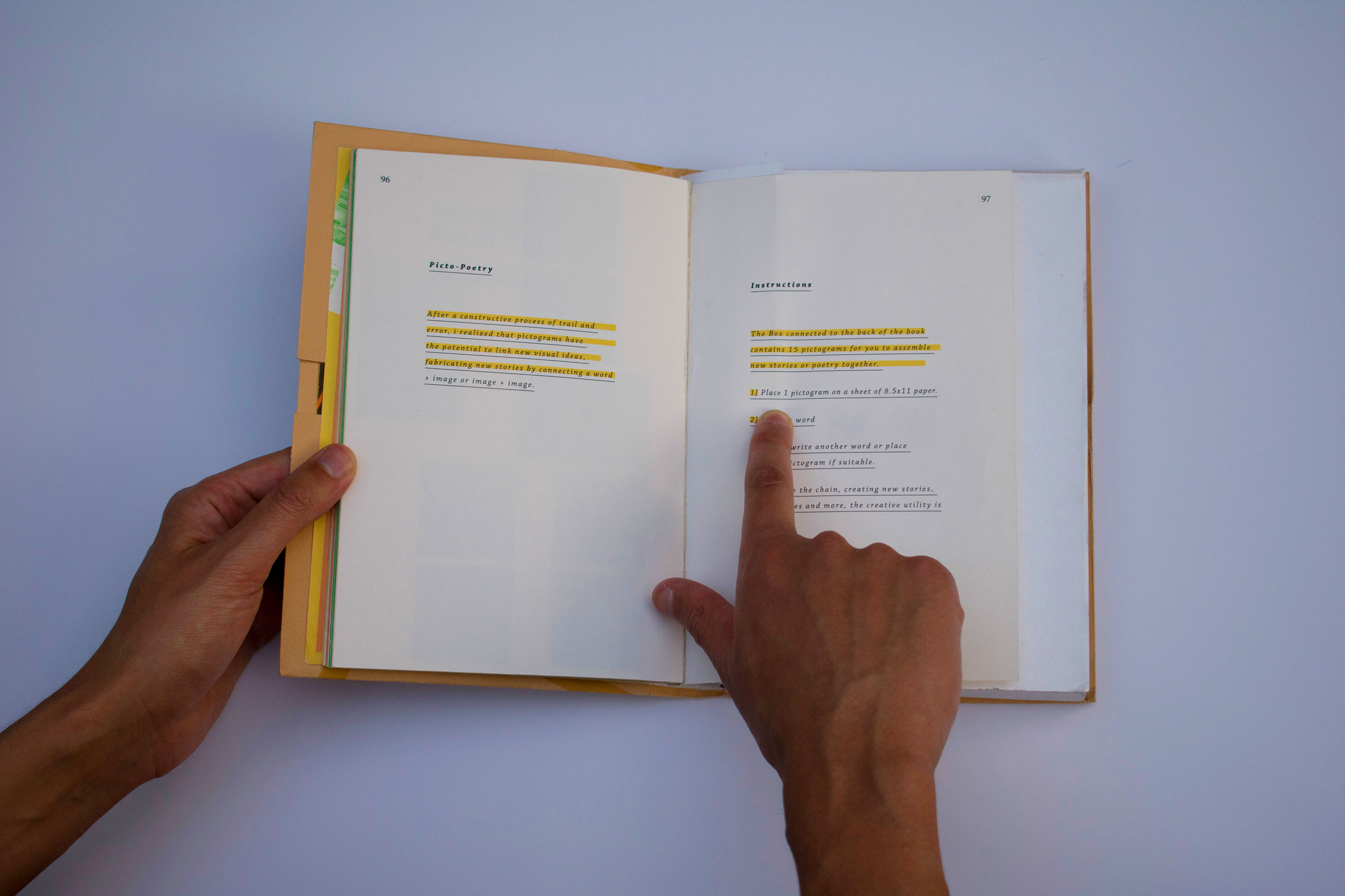
The goal was to aim for the “universal language” of visual images, form as language

I wanted to make the viewer think, but simple enough to not give up


A Legend in case you get stuck ;)

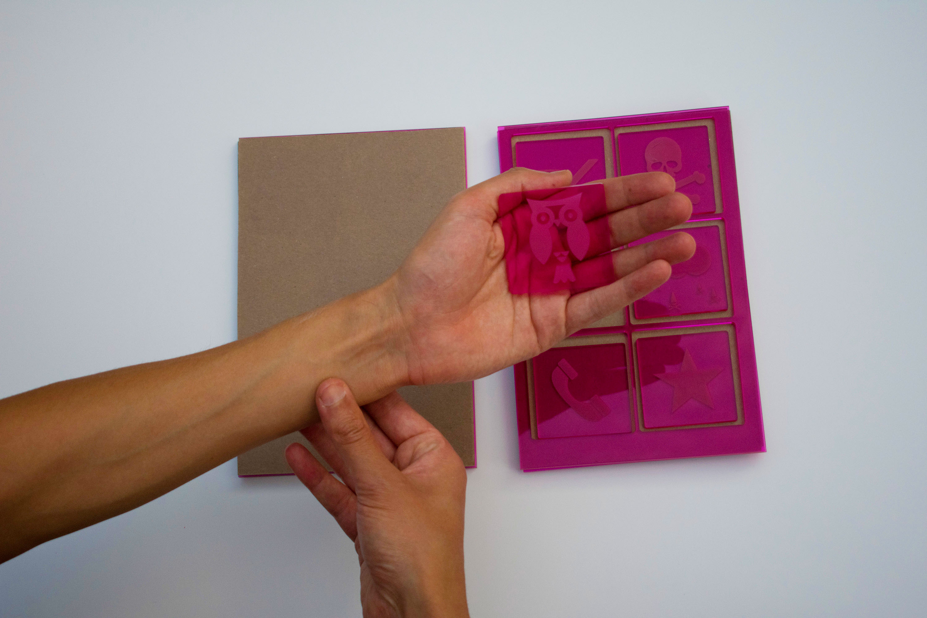

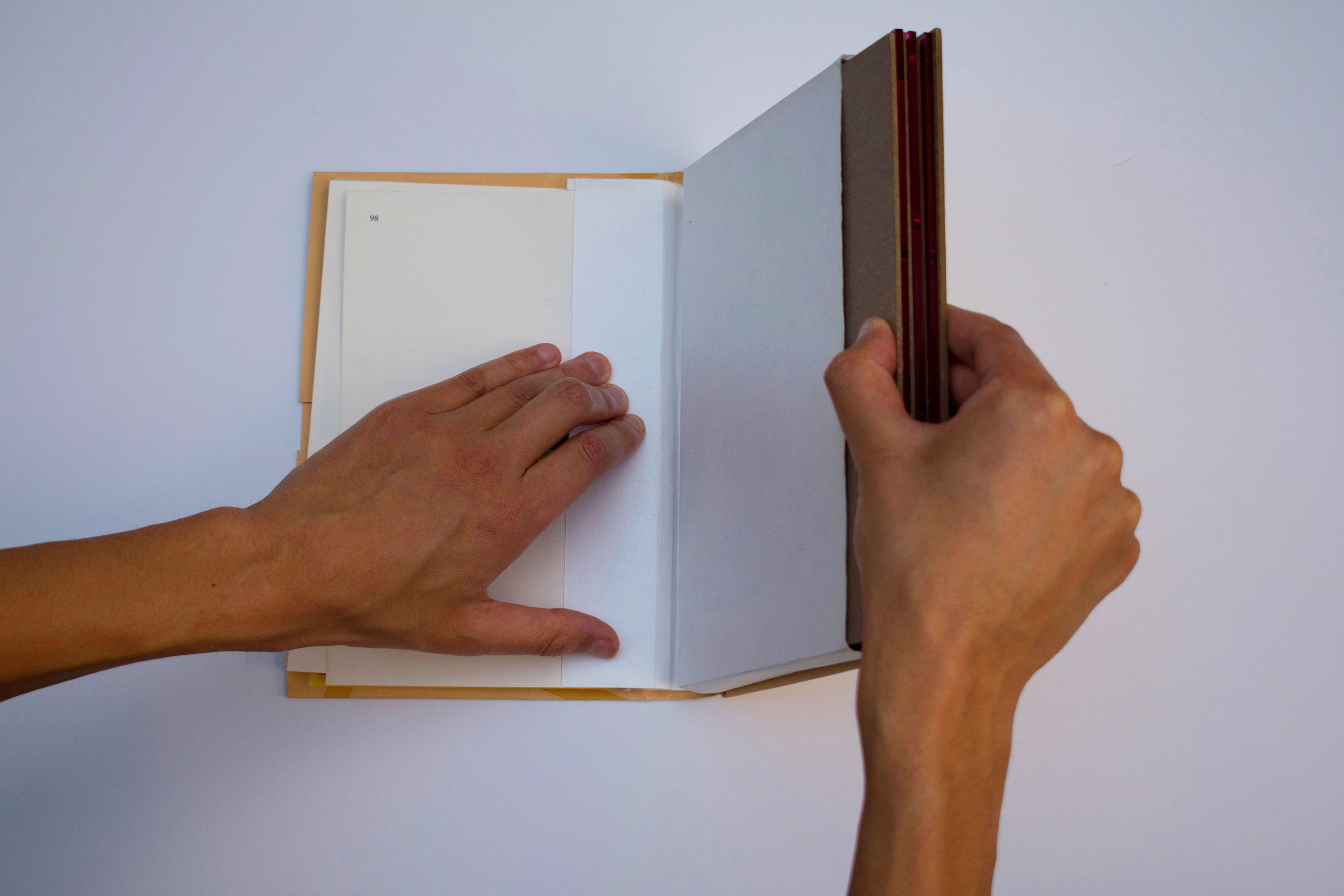
In the back lays 3 trays of lasercut blocks, so that you can take a paper and etch
pictograms from the book encouraging the user to make their own picto-poems.

Every pictogram in the book lasercut on acrylic
Feel free to view the book slideshow below to see each pictogram:


BACK NEXT
PRISON VS EDUCATION | 2013
Print, Poster Series, Typography
California spends an exponential amount more money on the industrial prison complex than education. This Poster series, Juxtaposes what we spend our money on within these state ran facilities.
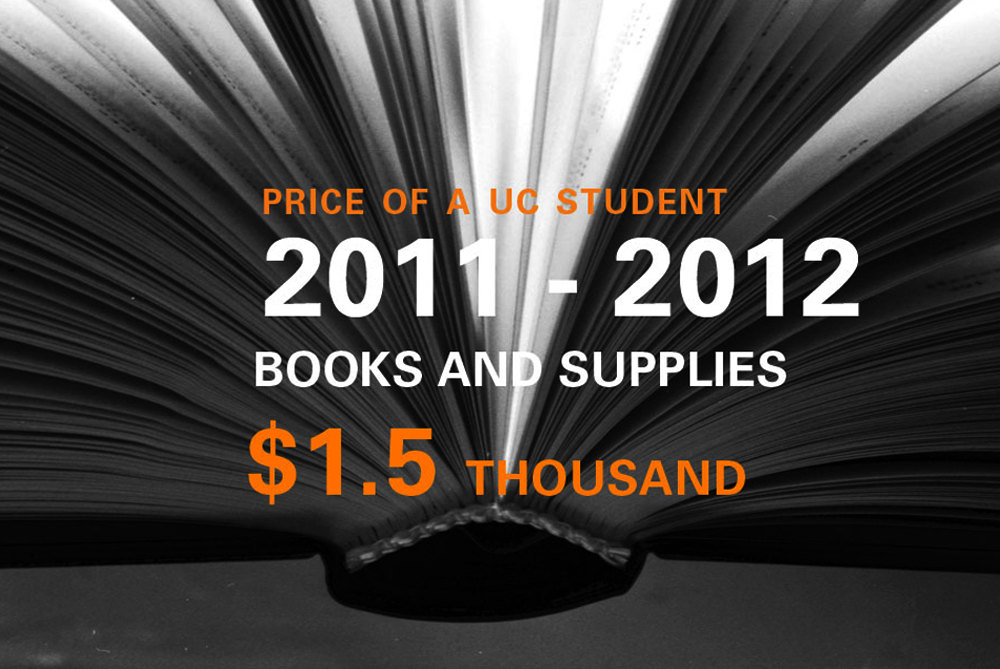


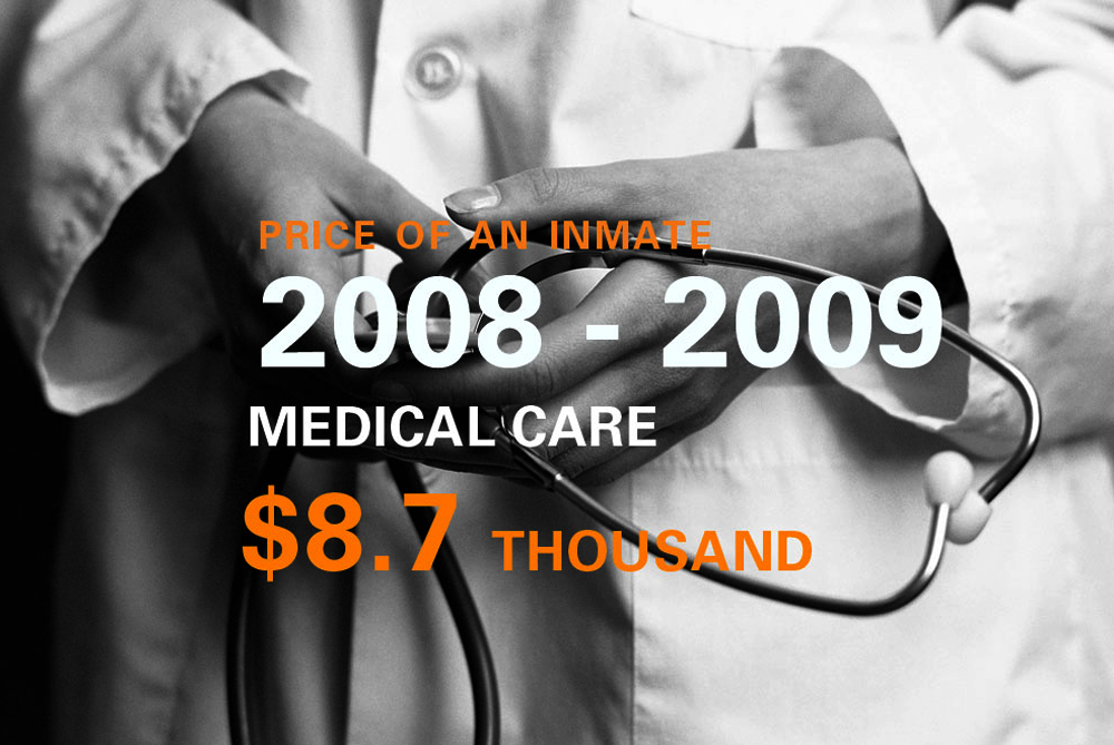


This was created under the mentorship of Peter Lunenfeld Professor of Design and Digital Humanities at UCLA. Statistics are from UCLA sociology department.
BACK NEXT

WINTER STUDENT SHOW | 2009
Poster, Typography, Experimental
The Winter student exhibition team asked me to make a poster for their bi-annual show that was eye catching yet readable.

Poster, 18"x24"

The posters were printed solo, and side byside to read the hidden message: “Artists for the sake of Art” Inspired by Roman Jaster.
BACK NEXT
UCLA
SONY
TOMS
JPL
Designed & Developed with love by Christopher Phillips Design, 2024, LA, CA