 Interactive
 Branding
 Print
Print
 Say hi
PortalQuest | 2023
UI/UX, Figma Prototype, AR Development, Logo Design, Sticker Print Design, Brand Strategy
PortalQuest is an AR experience to catch 12 AR characters released into the world. With a mobile-first design, we decided to make a very simple and clear way to show the User how to Hunt AR characters, Scan stickers, and Collect AR characters to get an NFT Reward for playing!
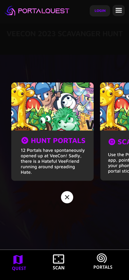
The Quest page showed users that a portal is a sticker to find and scan to see the AR character appear! Each Card informs the User to first Hunt, then Scan to collect to then get an NFT Reward.

The Scan page is the main page to scan a Portal sticker found in a live event, concert, or stadium to see the AR character come to life in front of your eyes.

Once users collect a portal they can see all of the portals they have scanned and the associated AR character they have collected. Prompting them to officially collect their AR character on openSea as an NFT.

Users were prompted to log in with their web3 information to be able to collect the AR characters they found!

Learning the Web 3 world can be challenging so we made a simple way to onboard our users.
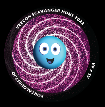
The Portals were printed as stickers for users to Scan with their phones, with no QR code necessary using our proprietary image scanning.

Logo Design was to make a simple, edgy yet fresh portal and to feel otherworldly.
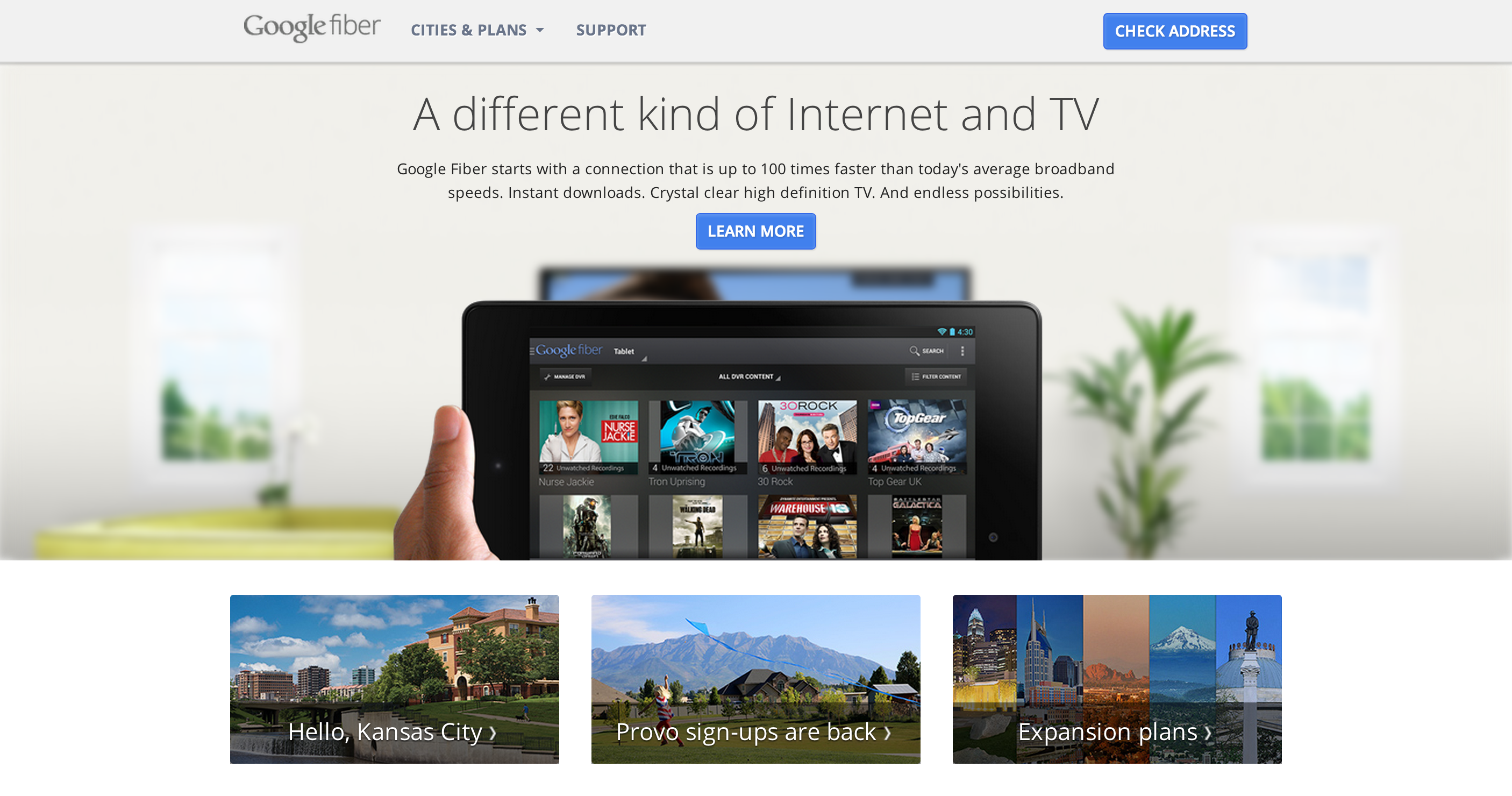
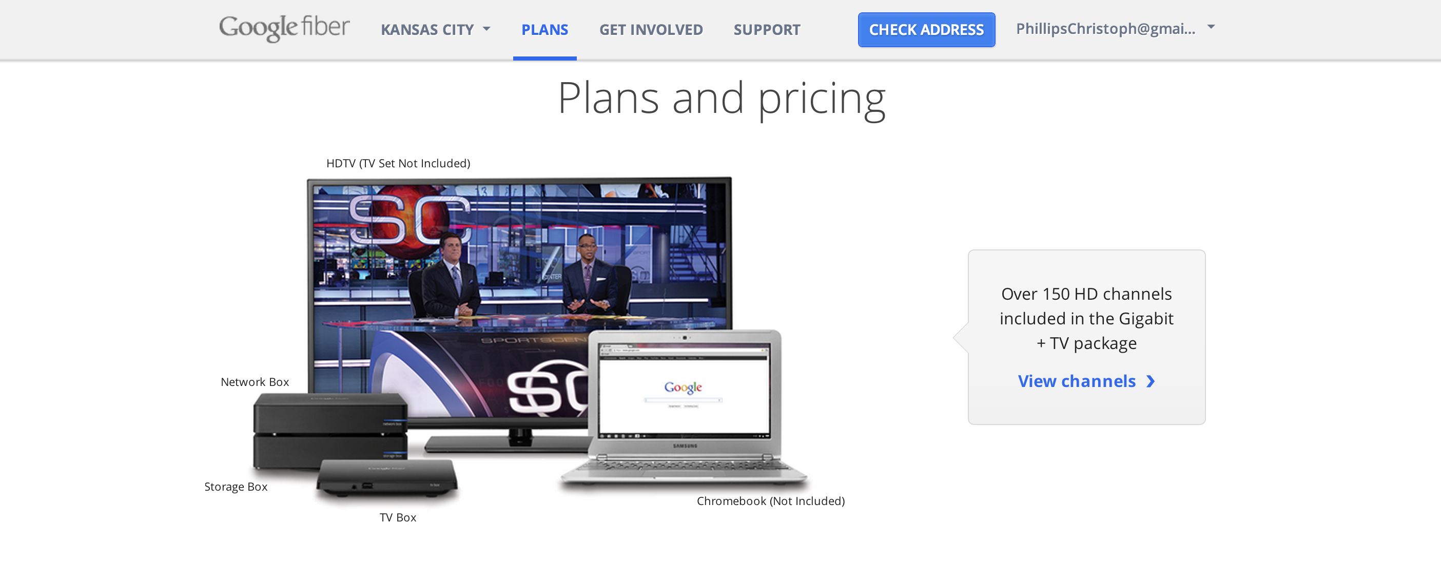
GOOGLE FIBER | 2013
Website Brand Identity Style Guide, UX, UI
While working at Left Field Labs, I helped with the team to create the Brand Style
Identity Guide and concept for the home page experience and site.
I chose the “Google blue” to keep with the brand, and the “Google Fiber Silver” to make
the fiber brand consistent, yet different from other google sites.
I chose to showcase the
experience of using Google Fiber in your home living room and devices to give you a
sense of the real product in your hands.
The Device hides on scroll, and the home devices become center focus.
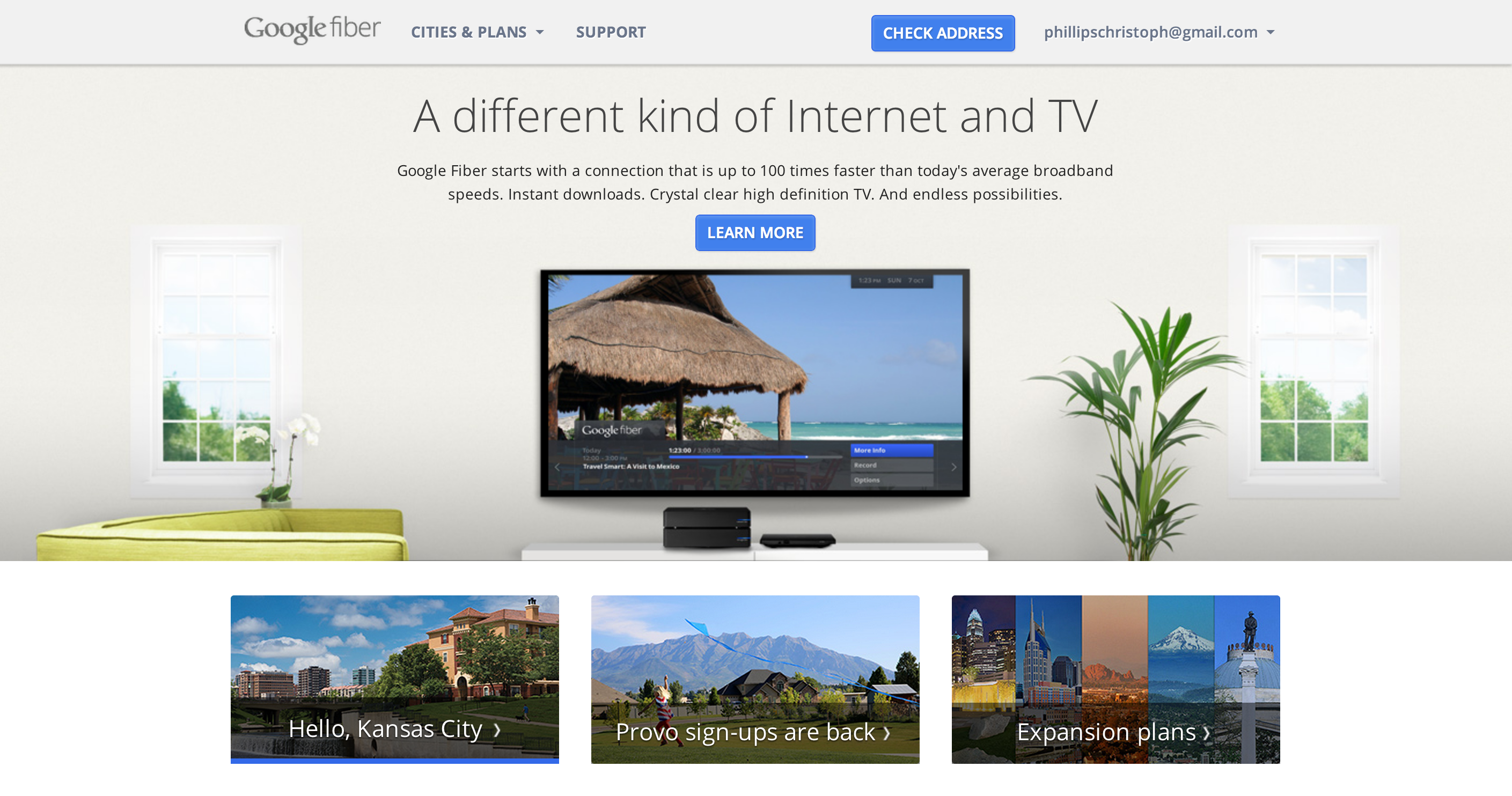
Showcasing the Tablet Controller, and TV box system

Test your current speeds vs google fiber’s 1gb/s super fast connectivity by watching a race!

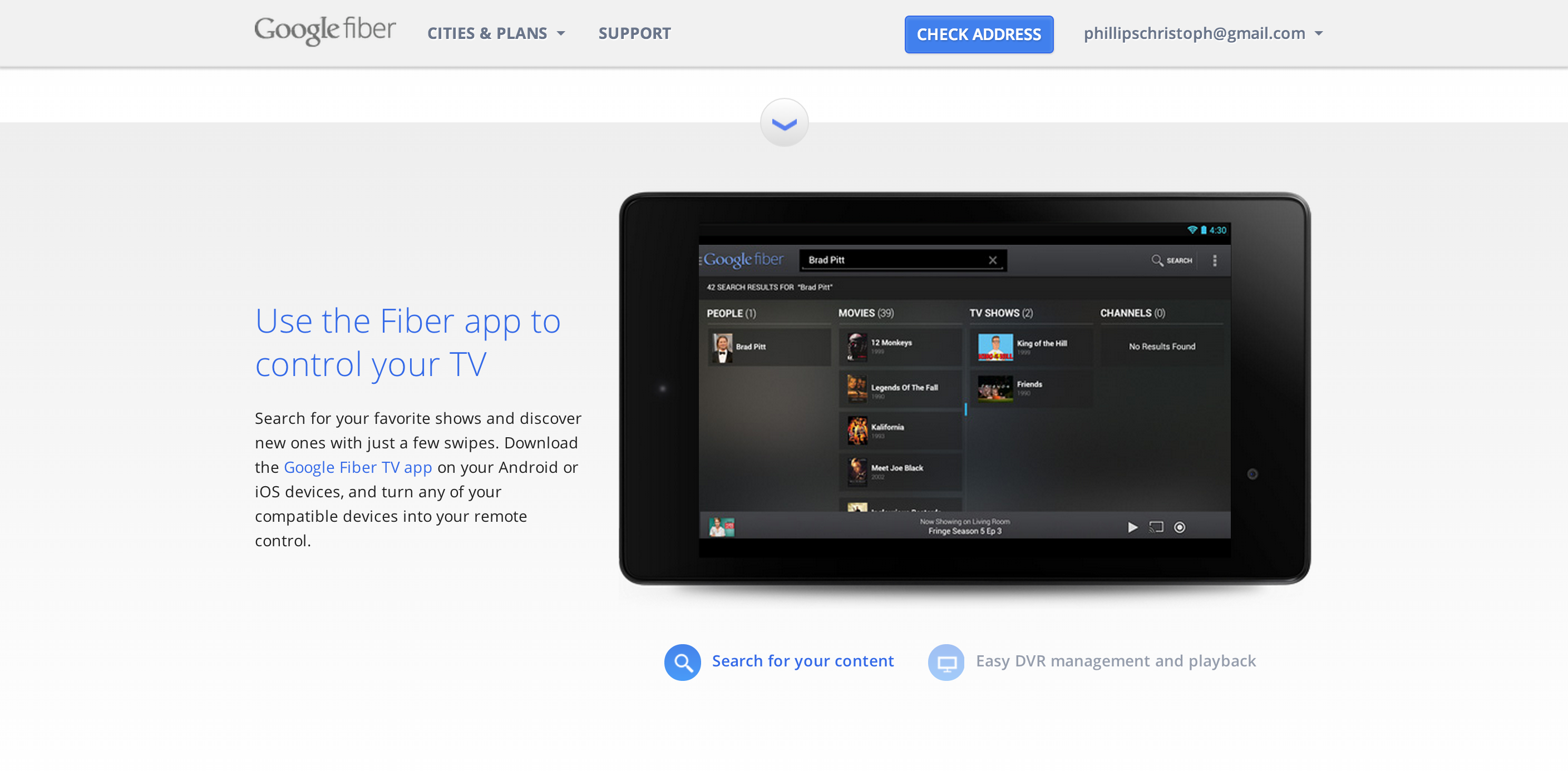
Showcasing the Fiber App on tablet, with custom icons below to navigate on screen functions

You can press the blue down arrows to move sections, or simply scroll
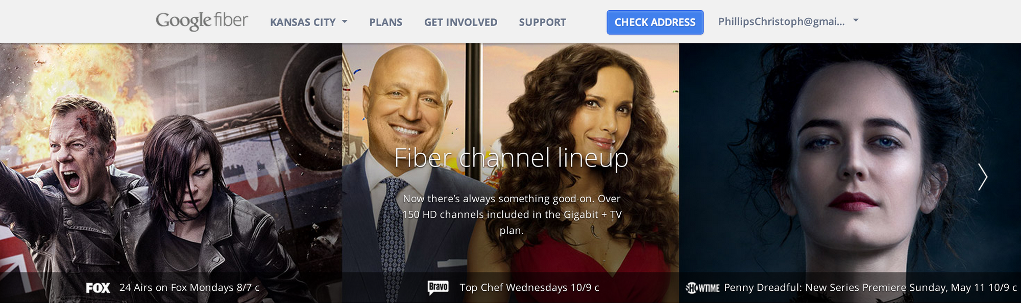
Over 100+ channels to choose from to deliver to the user, so I decided to make a “google search grid” to simplify the potential chaos
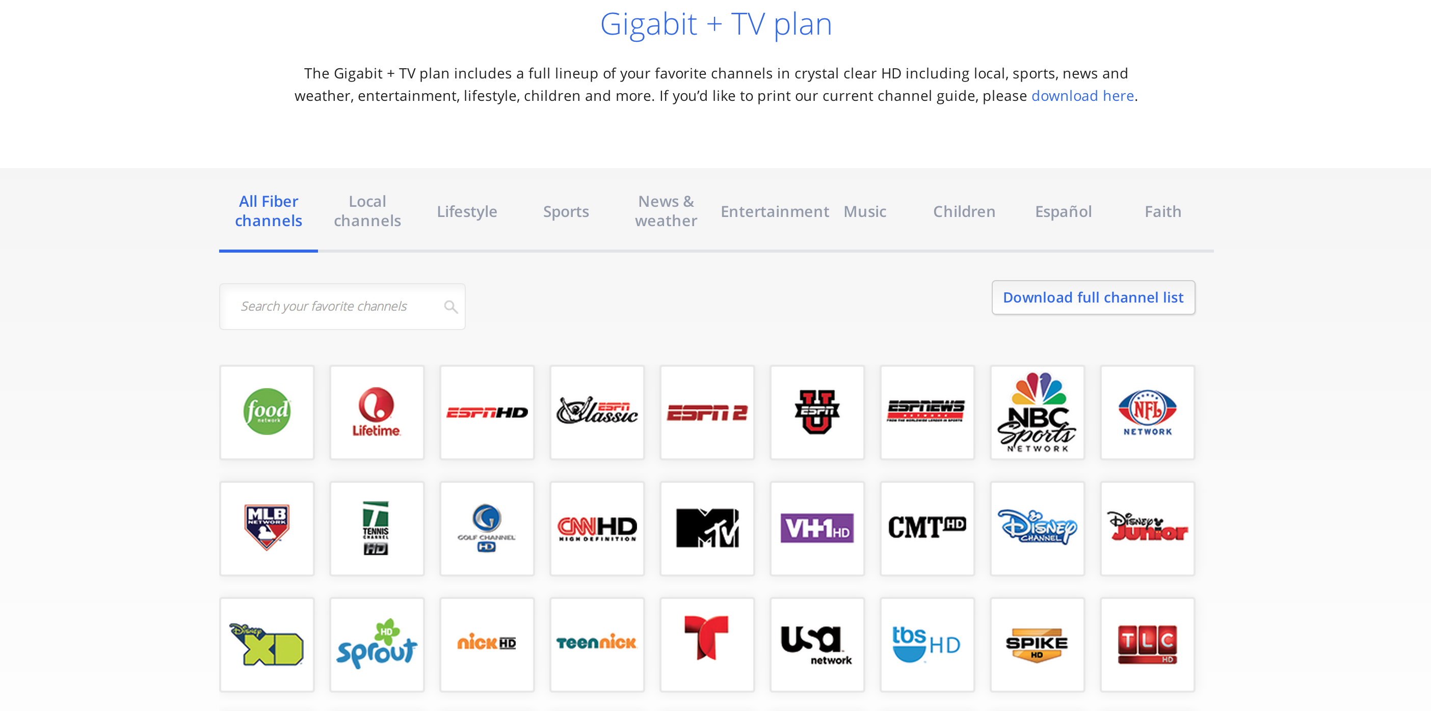
A search bar + responsive grid system, so the user can effortlessly find exactly
which channels they love
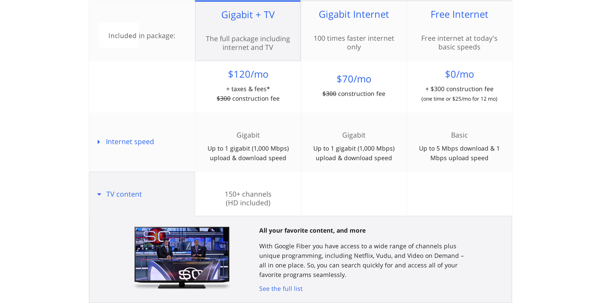
A collapsable grid system so you can get the simple comparison view, or read in depth.
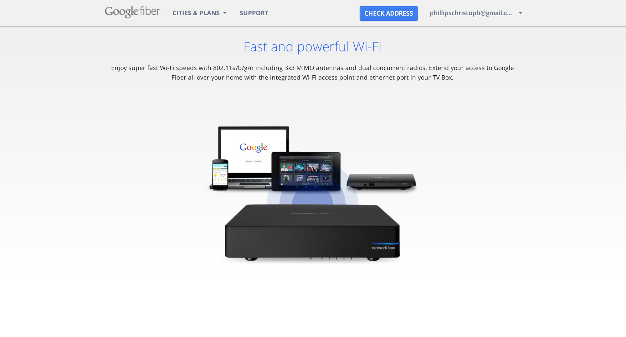
The final landing screen is an animated wifi network box showcasing the super fast connectivity across all your favorite google devices!
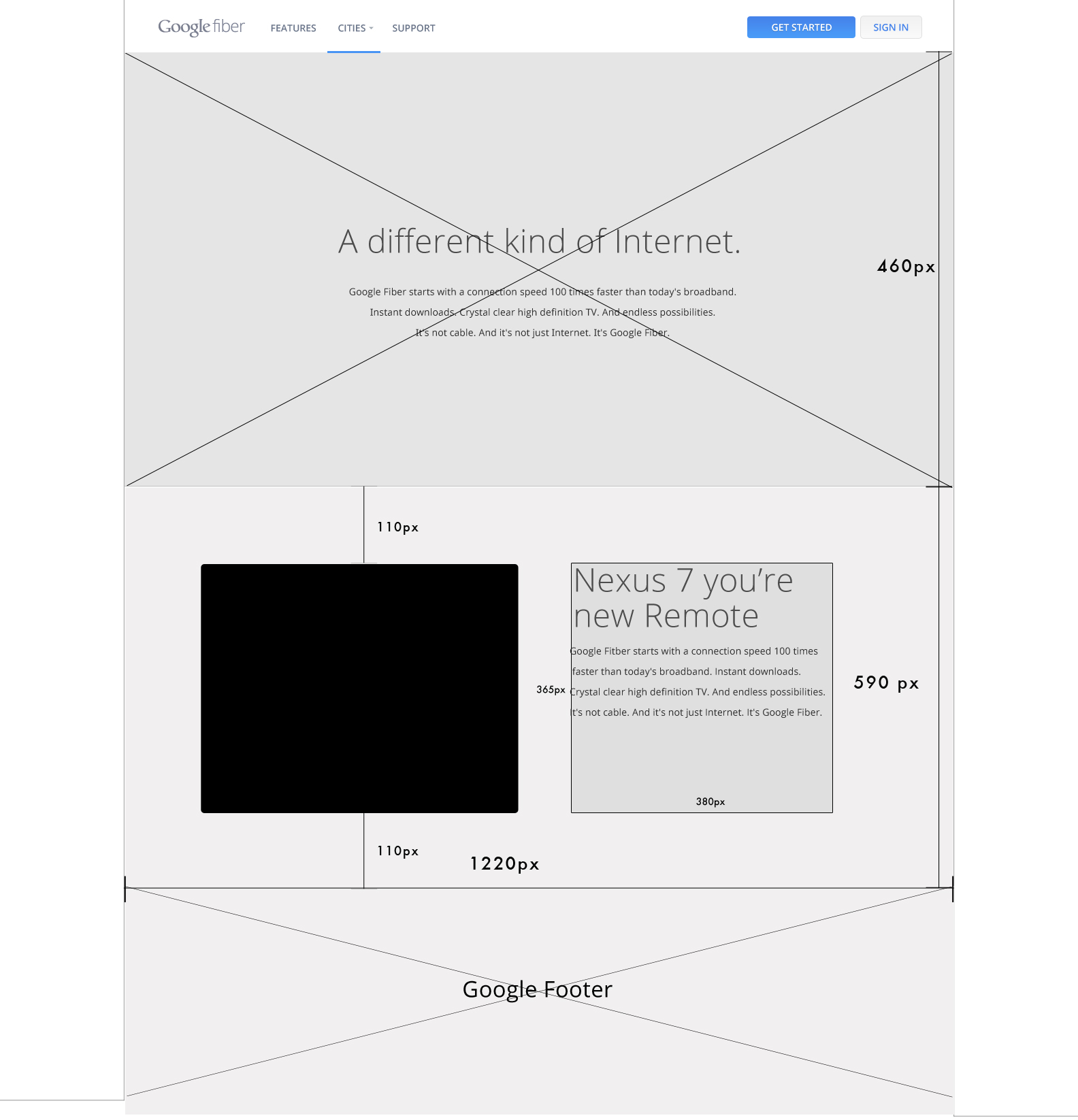
Early wireframe for the site built with adobe illustrator
BACK NEXT
Devavonne AI Logo + Website | 2023
UI/UX, Figma Prototype, 3D Web Development, Logo Design, Brand Strategy
Devavonne is an AI startup that is transforming the way you shop
by making an AI-powered style quiz that styles you and
sends you monthly Style Boxes based on your quiz results.
Devavonne came to me with the need for an entire brand from
Brand strategy, to Logo design to website design and development.
HomePage:
Landing Page:
HyperCommute App | 2019
UX, UI, Mobile App, Case Study
“BART estimates ridership will average 430,000 trips on weekdays and 129 million trips annually.1
The Prompt
I decided to realize the ideas of prompt 3 “Next Generation Transportation” because I am constantly noticing issues when I use the transit system in LA and it bothers me how confusing it is, especially for the first time. I find myself constantly lost in imagining the future, and it was the most user-focused because I enjoy thinking about the person I am helping via design. The way I see UI, is that we are ultimately striving to get a user what they want, with the least amount of steps necessary. I am 1000 times more compelled to design something if I am working on design innovation.
Ideation
HyperCommute is a luxury train app that makes your daily commute a simple & fun experience allowing you to always see where you are at, and fully control your cabin experience from your phone.
The Users
I first started with the general audience as: “Professionals over the age of 25 who commute every day on a train”
I did research online about how many people commute in San Francisco and thought about the different ages and reasons people commute. I created user-profiles and eventually created a persona that I saw the most common use, someone who would be our core user.
Meet Sarah she’s a 31-year-old writer and commutes utilizing the Bus, BART, and walking.

“Hi! I’m Sarah, I love traveling around my city and having coffee with my friends. I’m a napper and a foodie, but I get things done.”
I found Sarah’s Persona to feel more real only after empathizing with other people’s lives and commuter needs. After refining through a list of other personas that I could imagine other people using a commute train for.
Other User Personas
Steve, 50
The Traveling businessman who uses train multiple times in a day. “My life is hard work and dedication, but I need some daily downtime.”
Paul, 25
The freelance writer going to meet a friend for coffee often. “I can’t live life without coffee with a friend, it just gets me in the writing zone”
Sarah, 31
The hard-working power mom, who still finds time for coffee after work. “When I am on a train I want to be able to have some personal time, but still want to be able to update my kids where I am at”.
Kelly, 18
Student tourist, exploring the city for the first time. “Life is about finding a new place every day, new arts and culture and music”.
Mike, 29
The server, Travels a lot but does not use transit too often. “I think everyone should travel to a new place as often as they can with their loved ones”.
Max, 45
Amateur photographer, Uses transit to travel and visit new places and shoot multiple times a month.
A group of different individuals but, they all have two things in common: they need to commute regularly and have hours of downtime throughout their day on the train. Hours of downtime that could be a useful yet fun experience for them.
User Research: Card Sorting
After creating a general audience, I invited two user testers Mike and Max to do a user card sorting exercise and these were the results:

I asked both Mike and Max what they valued the most while on a luxury train, and how often they use one. What they saw as the highest priority was usually the highest trip utility feature and then food. I observed a pattern of what they each cared about the most then collected an average of the top 5 experience requests in order:
Trip steps: “I feel like I know what I am doing. It’s the highest utility”
Search: “I want a tool that makes me feel like I have an open-ended way to interact with any feature of the app.“
Food & Drinks: “Being comfortable is key for me. I’d like to eat and relax on a train”
Light & Temperature control: “It would drive me crazy to not be able to change the temperature. What if I want to sleep?”
Update a friend: “If I’m going to meet a friend, it would be helpful to show them how far away I am”
This hierarchy helped me directly translate the highest user priority into design features found in the final product.
Her Journey
She is on her way to work and plans her train route.
She commutes to work on the train.
After work, she decides to take the train to meet her friend Mitra for coffee.
She opens the HyperCommute app.
She types in “visit Mitra at Farley’s coffee shop”
She is curious how far away to her next stop the train is.
She opens the hypercommute app.
She views her trip overview card
She notices past food she has ordered before.
She orders a pizza slice.
She waits for the pizza.
She clicks the Cabin Controls page
She connects her phone to the speakers unde the cabin page
She plays relaxing music
She clicks the quick tab night light mode and takes a power nap.
She sees that her exit is coming soon on the top of the Cabin Controls page
She notices the reminder to update Mitra that she is nearby.
She updates Mitra she is 5 min away.
She exits the train and meets her friend Mitra for coffee.
Her Problem
Sarah needs to meet up with her friend, but she’s in a hurry and starving. She does not want to have to worry about missing her stop.
She wants to have the free time to be able to give her kids an update as to when she will be home and hopefully take a power nap after a long day of work. With all the hassle of where to go, when to get off, and not to mention line closures... there is no fun and easy way to do all of this.
The overall problem with public transit is that all trains get you from point A to point B but hardly any trains make this a fun or relaxing commuter experience.
The Solution
To have an app that tells Sarah geographic and trip data, reminding her friend or kids when she will be meeting them as well as to update when food is ready. To control your cabin experience allowing each user to personalize their daily commute utilizing pictograms and.
This solves the burning problem that Sarah has, which is not wanting to deal with the overwhelming hassle of which lines to take by automating the entire trip process after the first page. As well as by offering quick intuitive controls to make a boring situation, entertaining.
The Process
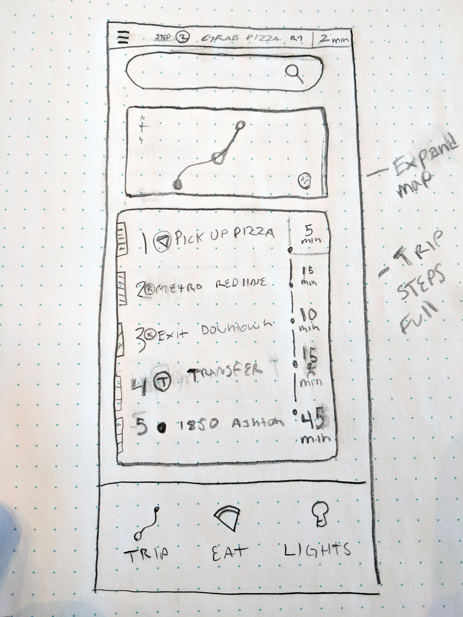
 Original hand drafted user interface wireframes
Over 25 drafts made during the Ideation and drafting phase

Steps + Trip + Order Food + 3 page main menu bar
Trip Extended + Steps Omnibar Update
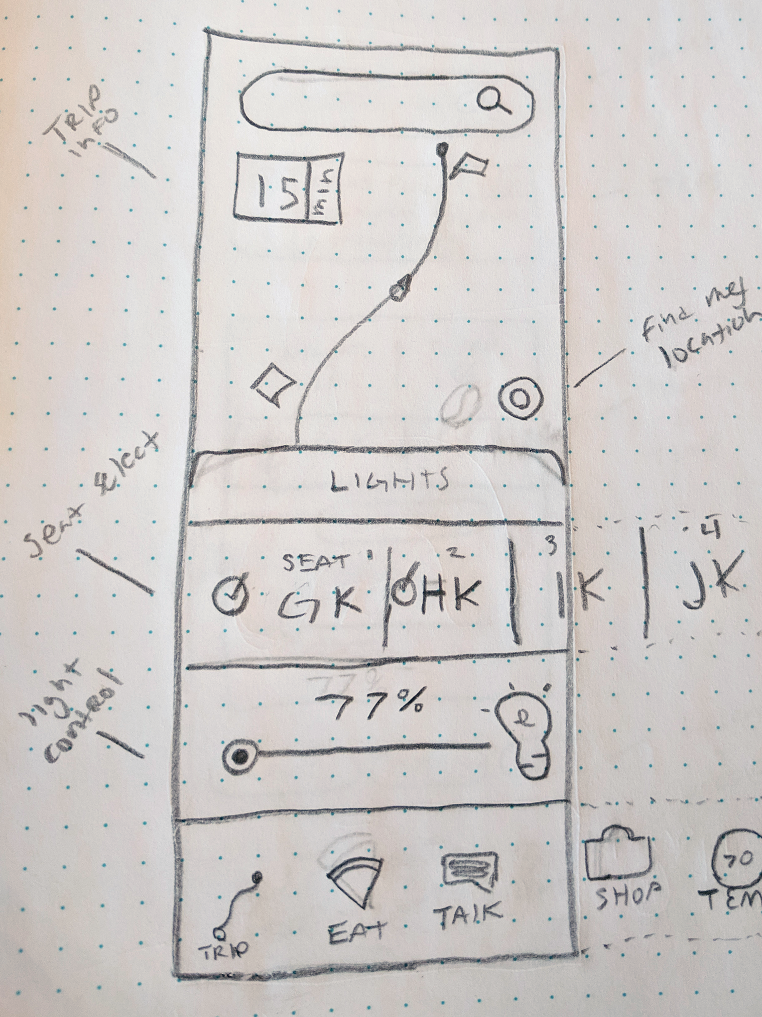
Cabin Controls
Early wireframes & mockups in sketch
On the right is the Eat page which ended up becoming a feature on the home page, and the base layout of an “expanded” detail shot was utilized for the Cabin Controls page instead. After my user data came back, I ended up deciding to focus on the Lighting & Temperature page since both Mike and Max ranked it in their top 5. I was also going to use a scroll feature, which ended up influencing the temperature gauge design.

Screenshot of my Sketch app design process
The driving force of my design process is the concept of an ever-evolving design with a series of generations as I progress. I copy a new canvas once a design has been changed to a degree that it starts looking like a separate idea and starts branching off. I then refined through the many artboards and chose the best 2 screens that my user testers liked and wanted to see more: Trip, and Cabin Controls.
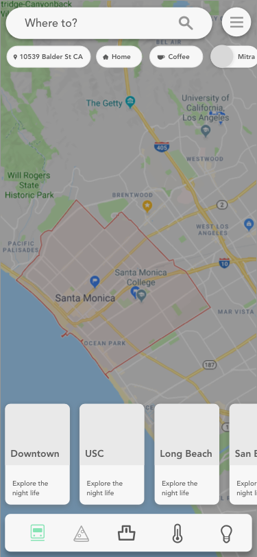
The Product
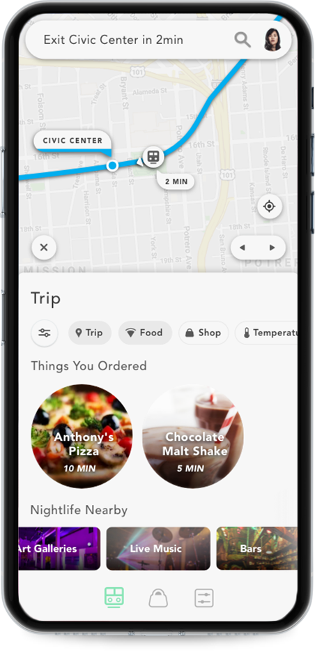
Sarah is on her way to meet her friend Mitra for coffee after work. She wants to see an overview of the trip she is on, and potentially order food.
The top bar is omnipresent displaying where and when Sarah needs to be eliminating her worry of missing her stop. There is also a search bar that is site-wide, and once clicked opens in place of the “current step”. The profile button opens a sidebar where profile settings, general settings, privacy, help and etc. can be found.
Very early on I decided to set limitations for myself. Never use color unless needed, always use rounded edges unless a straight line works better, always leave as much breathing room as possible, and only use a pictogram if I made it.
( “Home Page” - Infotainment Experience)
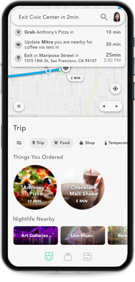
At any time Sarah can click the “Steps omnibar” to collapse it, allowing you to focus on the trip card, and quickly see where you are at. During the user research phase, this was a paramount feature which is why I made it an omnipresent bar.
The reason why I chose to have a profile photo as the sidebar button is that I am personally not the biggest fan of always using the hamburger. It does have its uses as a core function and if it is the best solution for the user in a context, then I’ll normally use it. In this case, I wanted to push myself and see if I could kill the hamburger sidebar. I have noticed that people almost always look for a sidebar, and will usually click in the top right or left to find it due to previous apps.
The overall aim for the top bar was to create a simple, handy, omnipresent utility belt that tells you all of the highest priority time-based trip information.
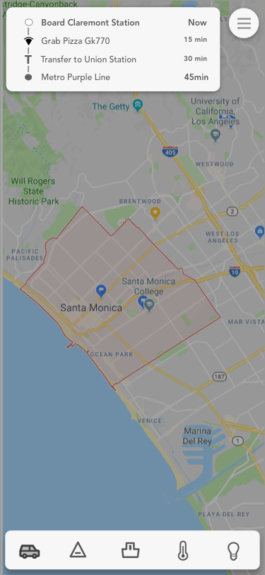
Trip Steps Expanded
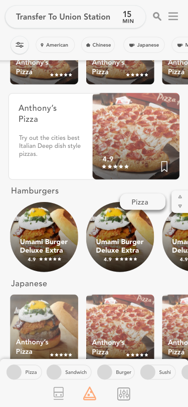
Located at the top is a filter tab system that can be horizontally scrolled to have quick access to frequently used features based on Sarah’s personal commute history. I am always a huge advocate of 1 click ideally, 2 clicks max. In this case, Sarah opens and sees the “Trip” page as the “home page” with the ability to toggle quick links based on general categories.
In this case, Sarah has pressed the trip and food filter buttons, to only see those options. Otherwise, this would be a page populated based on personal history and an average of other users. For example, since Sarah pressed the trip filter button, it’s evening time on a Friday, and she has already indicated she is getting coffee with a friend then the nightlife nearby tabs show her nearby venues.
If Sarah wants to access a full map view of where she is at, she can swipe the “Trip” bar down. At the end, she can click “My Location”, “Next Trip Steps” and “Exit Trip”. I wanted to focus on the actual train, as well as the line color making it easy to remember. The map line color is relative to the transit line you are on. The color also serves as a striking visual cue for future commutes.
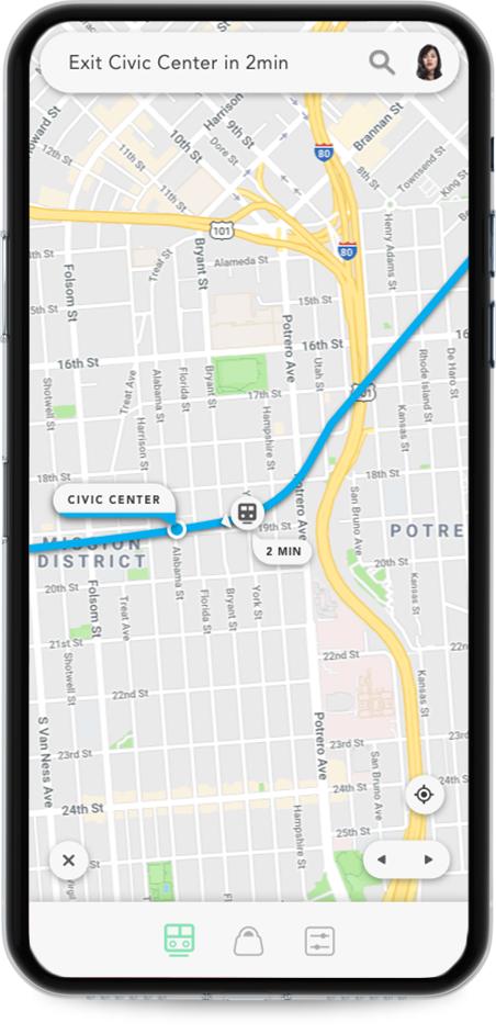
Map Only
Below, The Cabin page is a place for you to quickly be able to change the temperature, connect your phone to a smart TV, listen to music or set the lights to “Night Light Mode” and take a nap -- all in a single click.
At the top of the cabin page, the floating pill tabs that read “Temperature, TV, Speakers” are horizontally scrolling navigation tabs so that if the user needs to connect their speakers they have a quick way to access that. You can also just scroll.
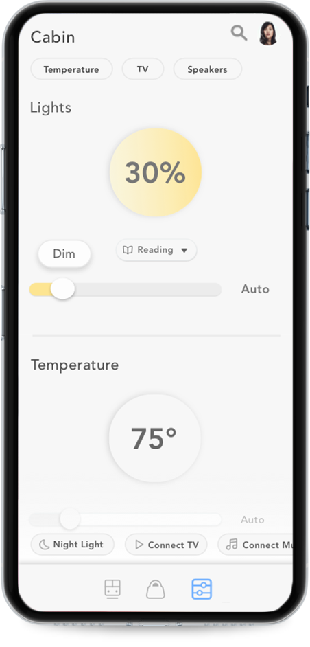
Cabin: Light Details
Before the user scrolls, the page title is displayed at the top main bar. After the user scrolls the “Steps Omnibar” displays your next step. This way the user can be updated where they are in the app, as well as on the trip to the same place. This way if Sarah ever feels the need to see “Where she is at” she always intuitively looks up. I originally had text below the Main navigation bar but once I decided on the top space as the area to alert important information it felt more solid and easy to remember for the user.
The lights and temperature page has a display of graphic infotainment by using colors to indicate heat and light, and grey to indicate lack of heat and light. I felt this would be visually interesting to the user meanwhile still quite minimal and intuitive.
While holding down the slider the dial of where you are at changes above your finger indicating “Hot, warm or cold”.
The Bottom floating pill tabs that say “Night Light” and “Connect TV” are relative page quick links that are based off your cabin history.
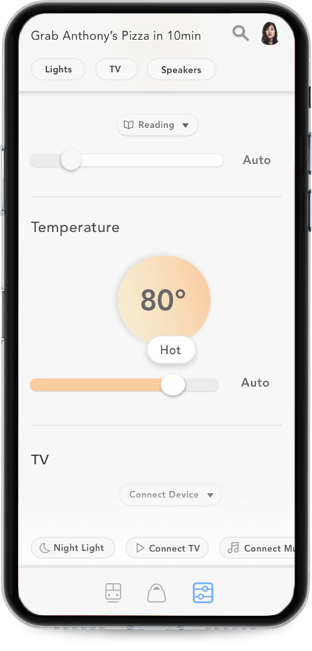
Cabin: Temperature Detail
The 3 navigation buttons on the bottom are Trip, Shop, and Cabin.
As a visual problem solver, I focused a lot on the pictograms for the bottom main bar remaking each one by hand over a dozen times until I found a cohesive unique visual family. Based on concepts of feng shui I decided that rounded strokes and shapes would be more naturally inviting as opposed to the traditional sharper edges. The rounded edges idea transferred over to the symbols used throughout the entire app including the button shapes and the font choice (Avenir). In all of my designs, I usually opt for a stark contrast and I felt the sharpness still communicated via contrast versus literally sharp edges.

The colored icons signal which page you are at on the moment. I wanted to challenge myself by working with a limitation... making the pictograms outline-based...and 100% made in the sketch. Even the few google material design icons used on the page were re-designed with a rounded thin-stroke look.

The pictograms for the shop were originally a pizza for a while to indicate “eat” and I had four buttons: Trip, Eat, Shop, Controls. I have always been a huge advocate of “less is more” and specifically, the fewer pages the better. This is part of why there is no specific “home button”. The homepage of this site is always the trip page. I decided this because it has a quick overview and access to almost every feature of the app allowing you to scroll, and explore.
What I Learned
I learned how to extract more detailed step-by-step information from the user’s initial problem and how to use that data to directly influence the design hierarchy. I learned how you must collaborate with the user, many times. I had my user testers come back again, and with every round of user testing, I would learn that something I assumed was not so obvious, was communicated just fine and vice versa.
I learned how to balance my interaction and visual ideas together and think of ways to communicate my ideas from paper to another human being. I learned technically a lot more about the sketch, as one of my limitations for this project was to only use sketch mainly because I feel proficient at illustrator and want to refine my toolbelt.
What I Would Change
I would spend less time on perfecting each version, and more time refining the ideas away to the core essentials. Core to both the user, and the investor.
I want to add voice control and google assistant because I could see voice commands like “Change lights to sleep mode” or “Order pizza” happening. I am surprised I didn’t think of it sooner. Adding this feature would be in the next round of revisions.
Lastly, in my philosophy design is never truly done. It’s an ever evolving process and I am happy to grow with it.
Thank you for looking into my mind, as I ultimately strive to alleviate human suffering by eliminating onscreen struggle.
-Christopher Phillips
1 https://www.bart.gov/sites/default/files/docs/2016Factsheet_v12.pdf
BACK NEXT
GOOGLE + REDESIGN | 2018
Website, UX, UI, Responsive App
A more simple, standard social media redesign of google + for a user centeric social media.
Using Google Speech to text, search, AR, Groups, News and more
(Personal UI + UX Independent study made with Sketch + Adobe Illustrator)
Mobile at Iphone X Screen Size
A modern social media from Google,
using a “story” platform approach integrating Google’s AR ecosystem.