 Interactive
 Branding
 Print
Print
 Say hi
INVITE | 2015
UI, UX, Typography, Iconography
The idea was to design a UI that is simply inviting to the user.
My client approached me asking for UX/UI a simple logo, color, image treatment, iconography & typography.

The client wanted the site to be “feel solid, yet inviting”. I chose black, blue and white originally but decided to take the dark blue to a much lighter blue color as the primary background on the login page. As well as use a dark grey instead of pure black to ease the eye.

Each icon was designed to feel like a cohesive family of icons
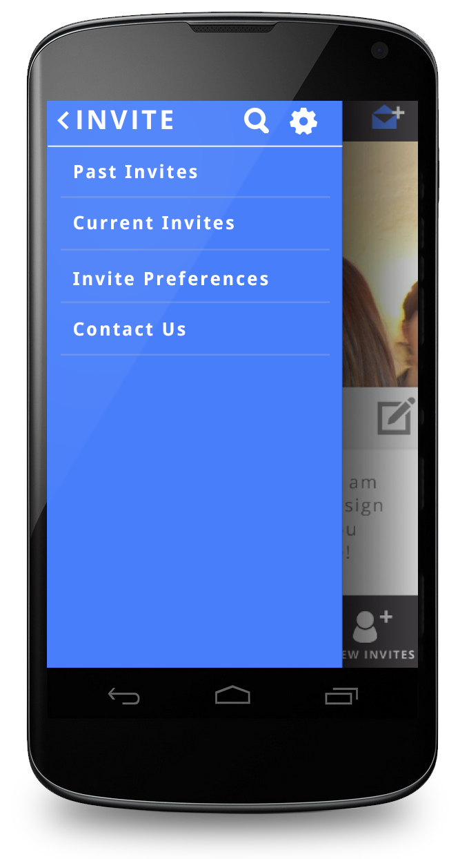
I suggested an expandable side tray to condense the amount of information/pages. The tray was not popping, so I decided to solve that with a drop shadow overlay allowing the tray to appear above the layer in z-space.
BACK NEXT
UCLA
SONY
TOMS
JPL
Designed & Developed with love by Christopher Phillips Design, 2024, LA, CA