 Interactive
 Branding
 Print
Print
 Say hi
GOOGLE FIBER | 2013
Website Brand Identity Style Guide, UX, UI
While working at Left Field Labs, I helped with the team to create the Brand Style
Identity Guide and concept for the home page experience and site.
I chose the “Google blue” to keep with the brand, and the “Google Fiber Silver” to make
the fiber brand consistent, yet different from other google sites.
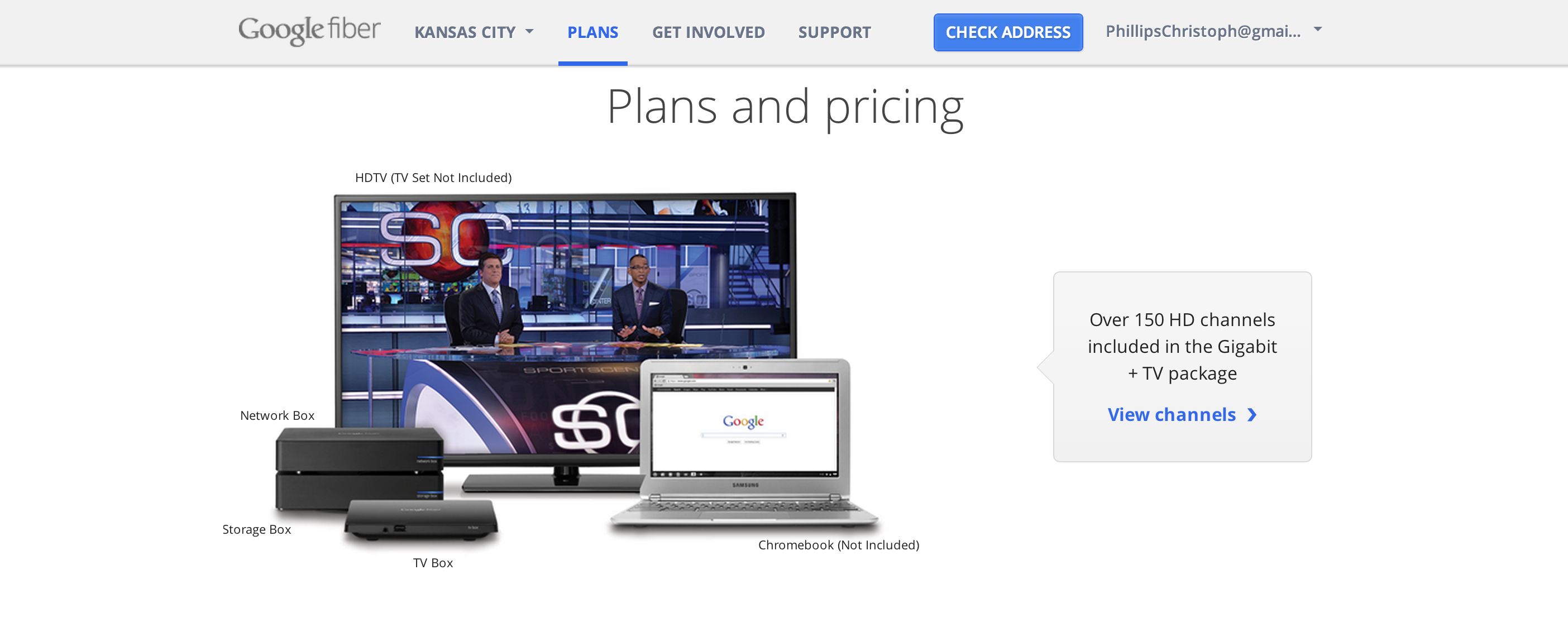
I chose to showcase the
experience of using Google Fiber in your home living room and devices to give you a
sense of the real product in your hands.
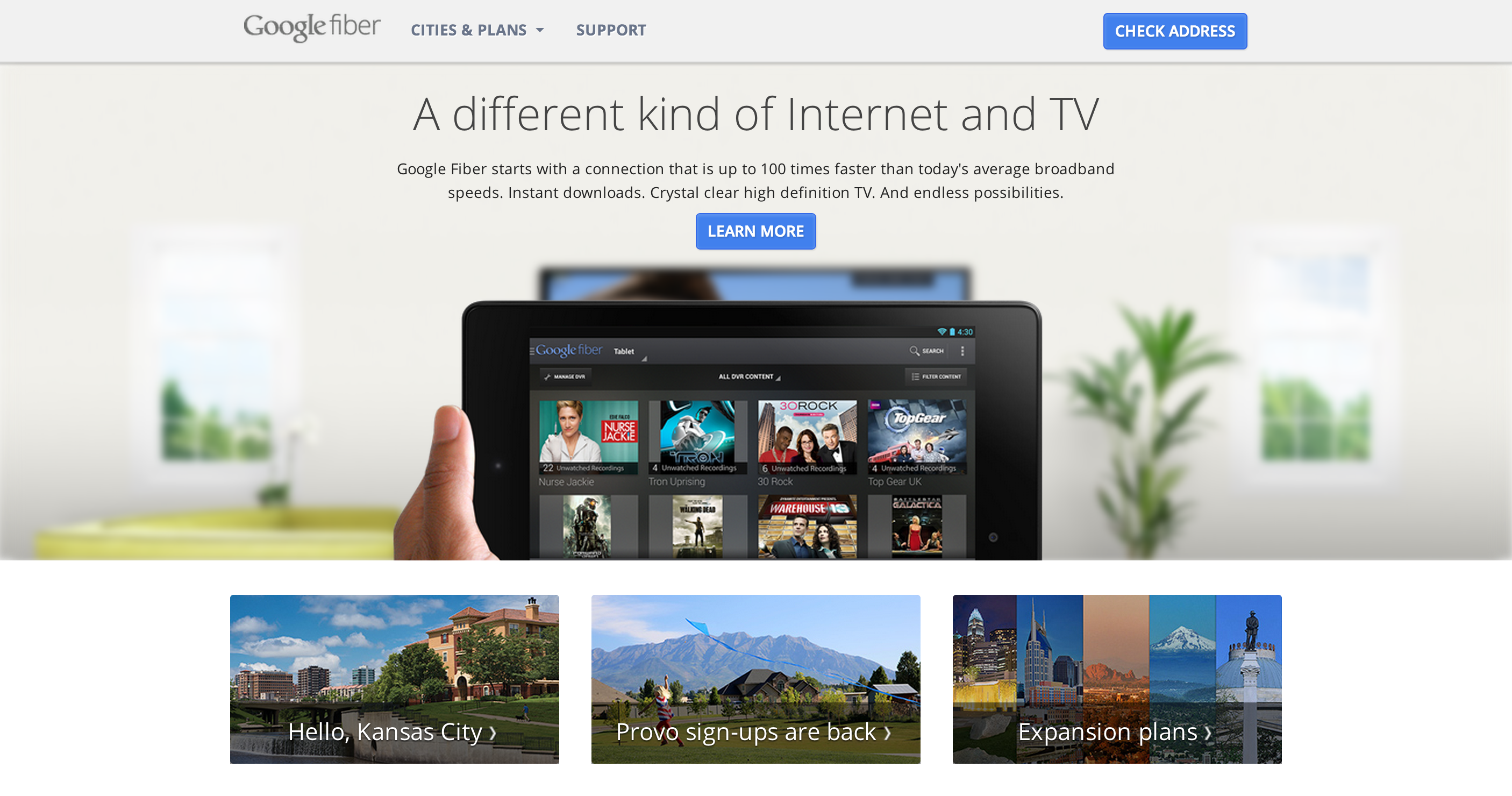
The Device hides on scroll, and the home devices become center focus.
Showcasing the Tablet Controller, and TV box system

Test your current speeds vs google fiber’s 1gb/s super fast connectivity by watching a race!

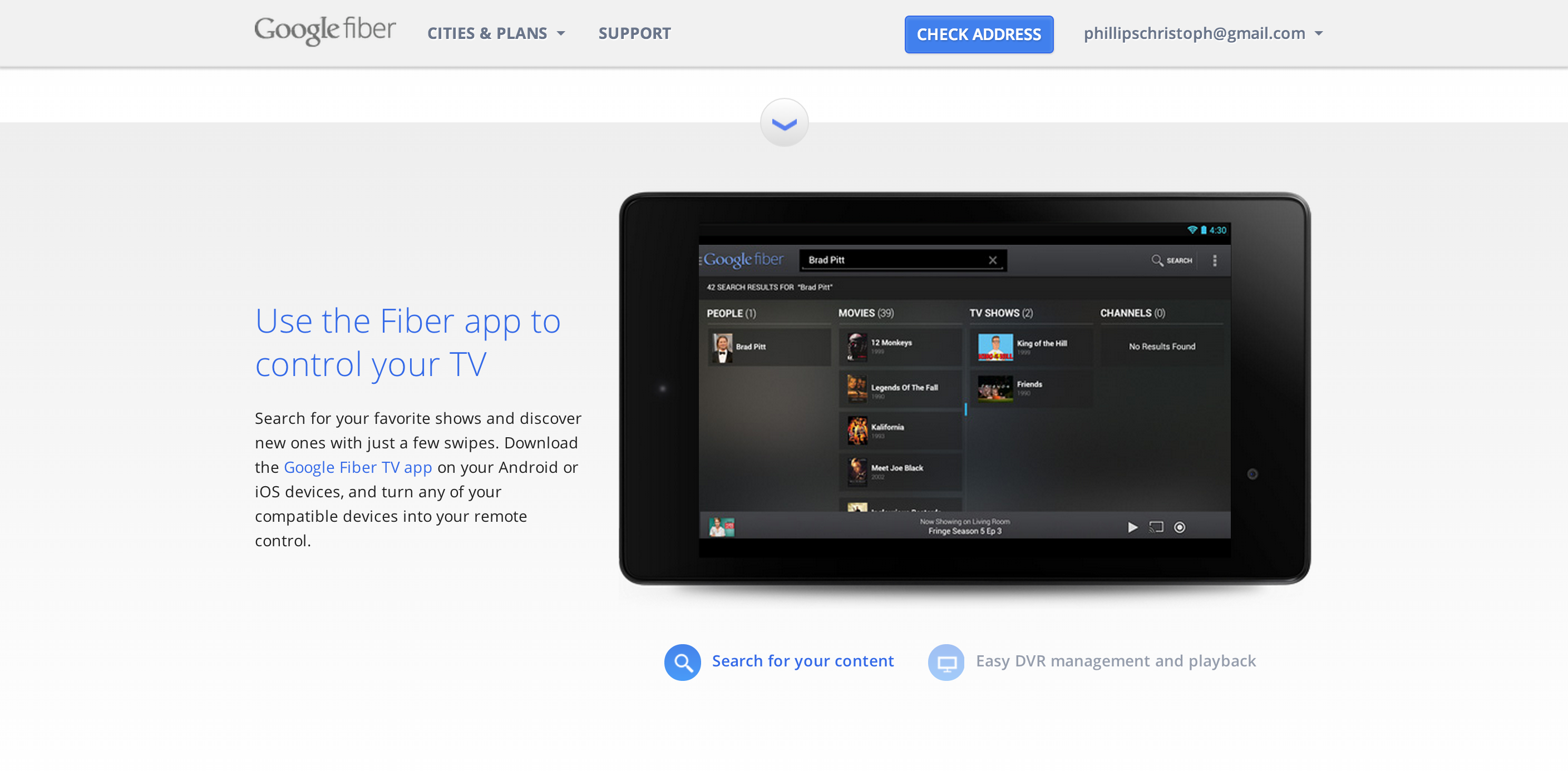
Showcasing the Fiber App on tablet, with custom icons below to navigate on screen functions

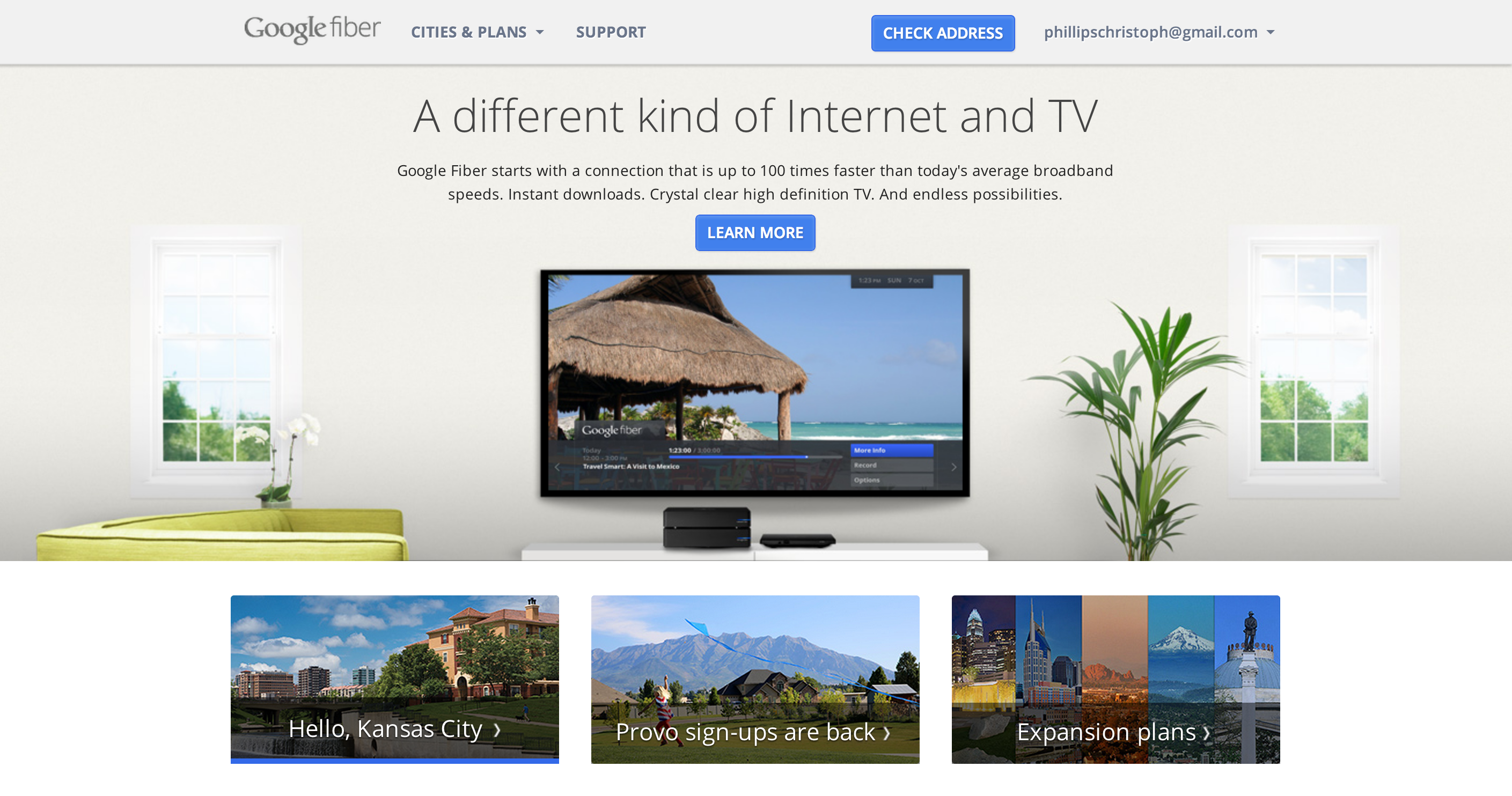
You can press the blue down arrows to move sections, or simply scroll
Over 100+ channels to choose from to deliver to the user, so I decided to make a “google search grid” to simplify the potential chaos
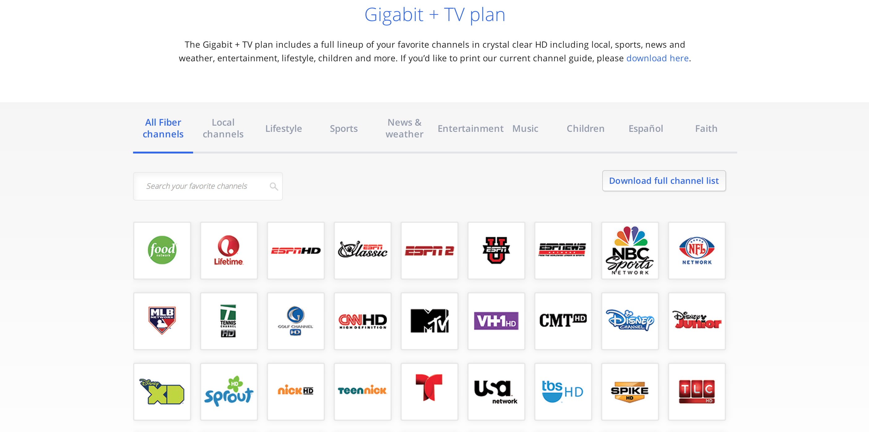
A search bar + responsive grid system, so the user can effortlessly find exactly
which channels they love
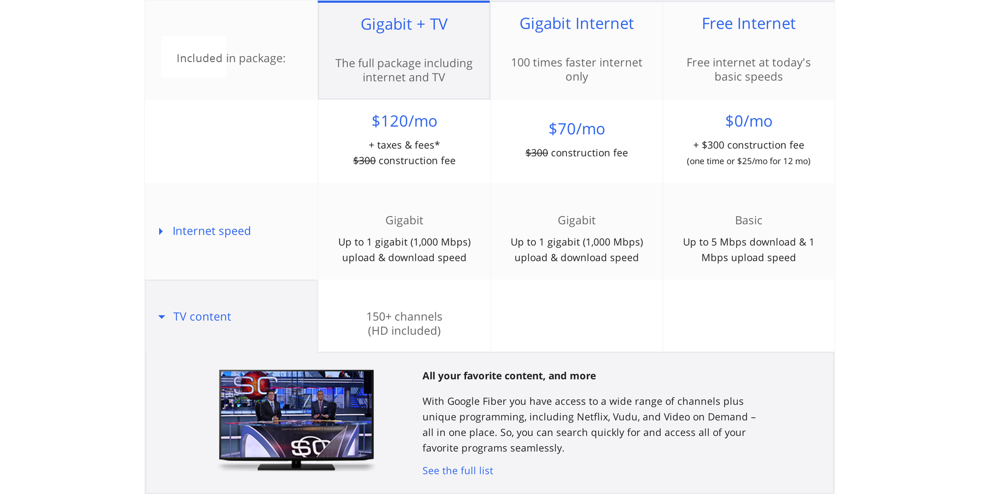
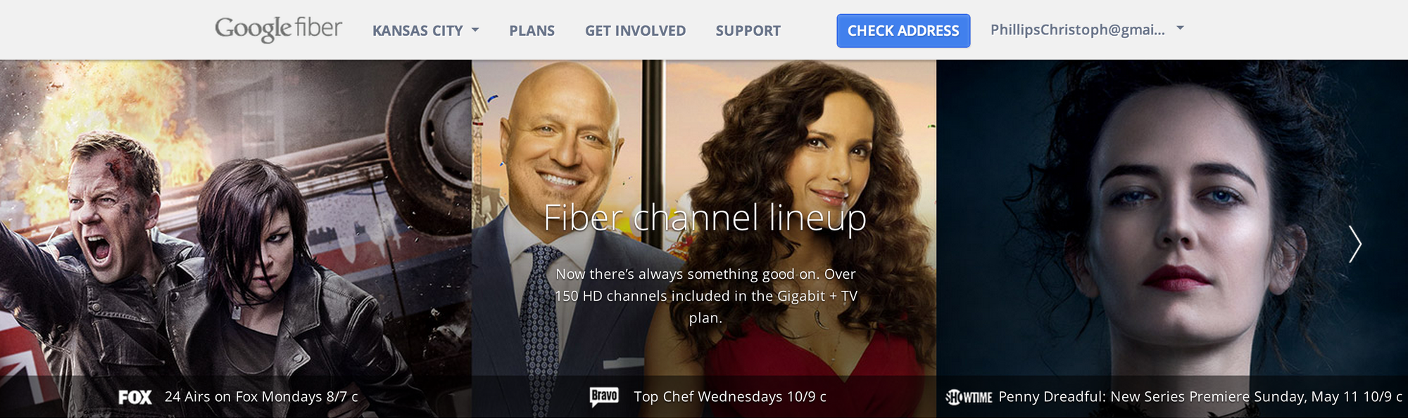
A collapsable grid system so you can get the simple comparison view, or read in depth.
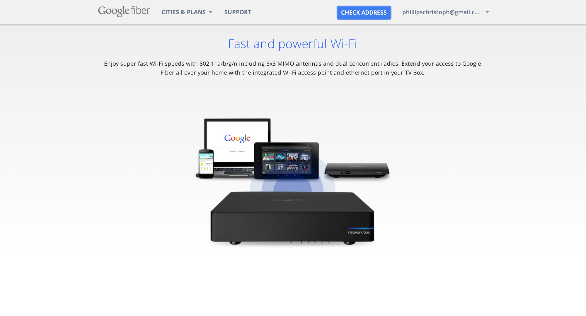
The final landing screen is an animated wifi network box showcasing the super fast connectivity across all your favorite google devices!
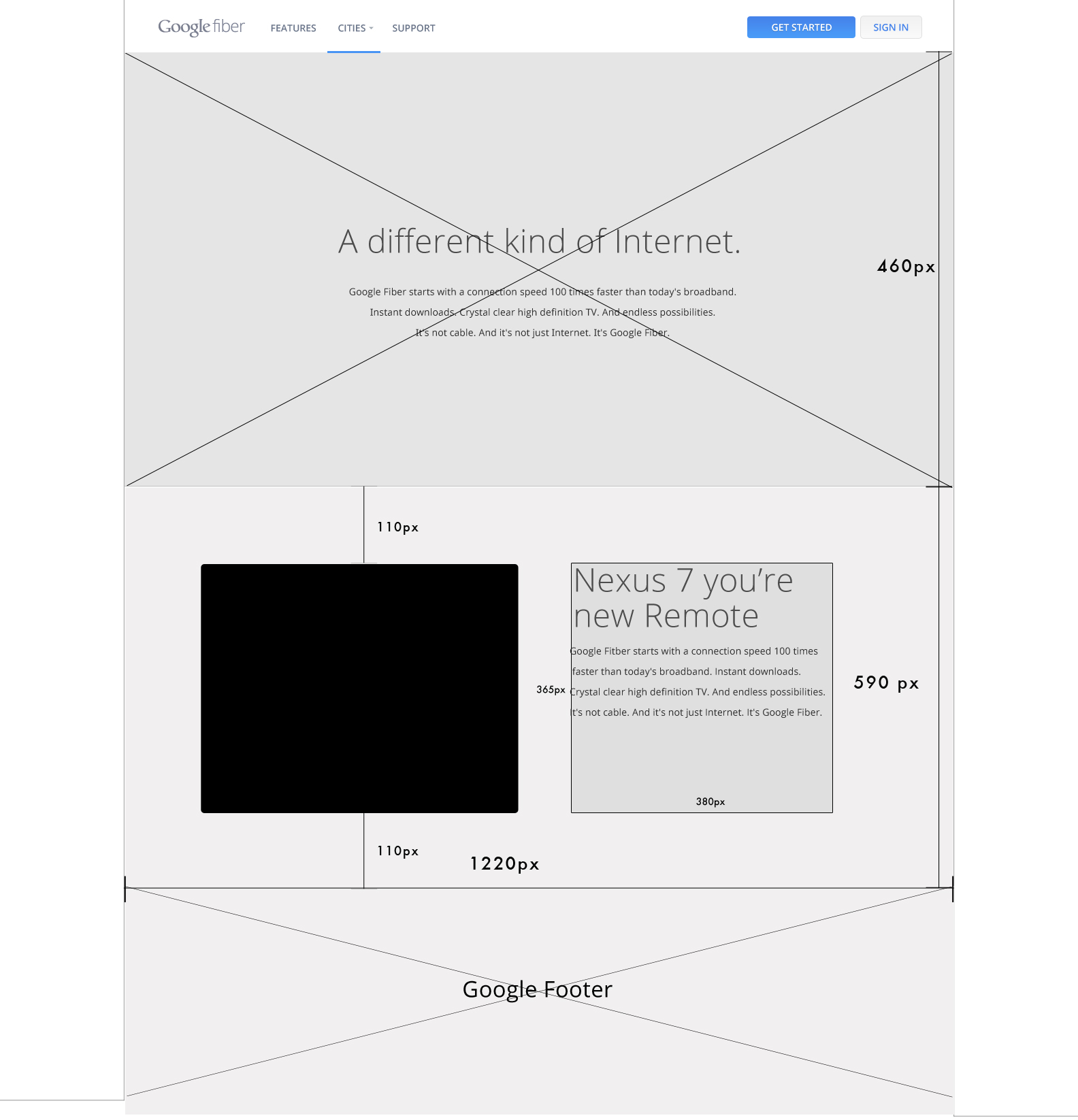
Early wireframe for the site built with adobe illustrator