Constant
Contact
Visit live website (opens in a new tab)Helping small businesses find the right tools to grow.
As Senior UI/UX Designer for Web, I used the homepage as the starting point for a new brand and a reusable design system, helping people discover Constant Contact’s marketing tools across the site.
Designer, Web
and marketers
and design system
creative leadership
01 / Problem
A first impression
that needed to earn trust.
After years without a major web-brand investment, Constant Contact faced trust and conversion challenges: few visitors scrolled past the hero, and trial and paid conversion rates were low. The homepage needed to communicate value and give visitors confidence to take the next step.
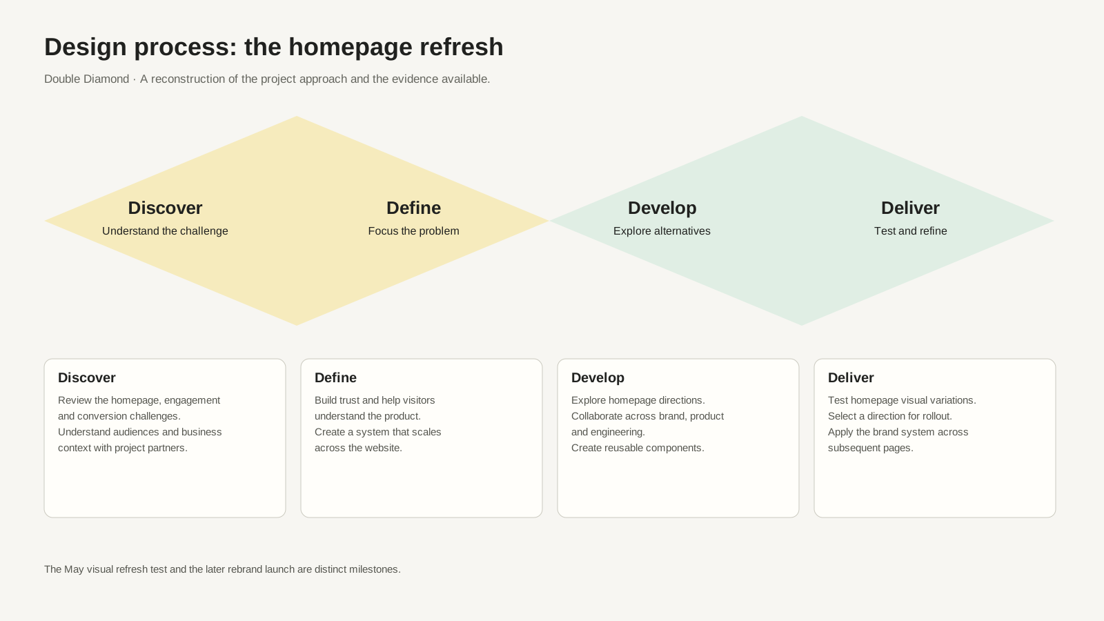
My approach / Double Diamond
From understanding the problem to delivering a system.
Who we designed for
Different businesses.
Different starting points.
From first-time founders to franchise teams, visitors needed to find a path that matched their business.
Starting out
First-time founders & entrepreneurs
- Customer type: New business or side hustle
- Age: Not specified in the briefs
- Goal: Reach first customers
- Need: An understandable first step
- Consideration: Entry-level tools
Growing a business
Solopreneurs & small business owners
- Customer type: Single-business owner
- Age: Not specified in the briefs
- Goal: Reach and retain customers
- Need: Tools that grow with the business
- Consideration: Email, social, and text
Managing locations
Franchise owners & multi-account teams
- Customer type: Multi-location business or franchise
- Age: Not specified in the briefs
- Goal: Coordinate marketing across teams
- Need: Consistent brand presentation
- Consideration: Multi-account options
Audience groups come from the project briefs. Needs are working assumptions for design, not findings from individual interviews.
Homepage explorations
Exploring the
first impression.
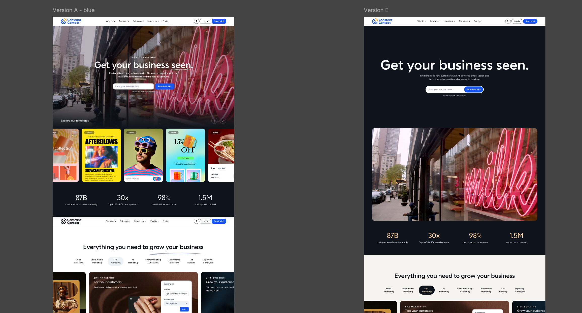
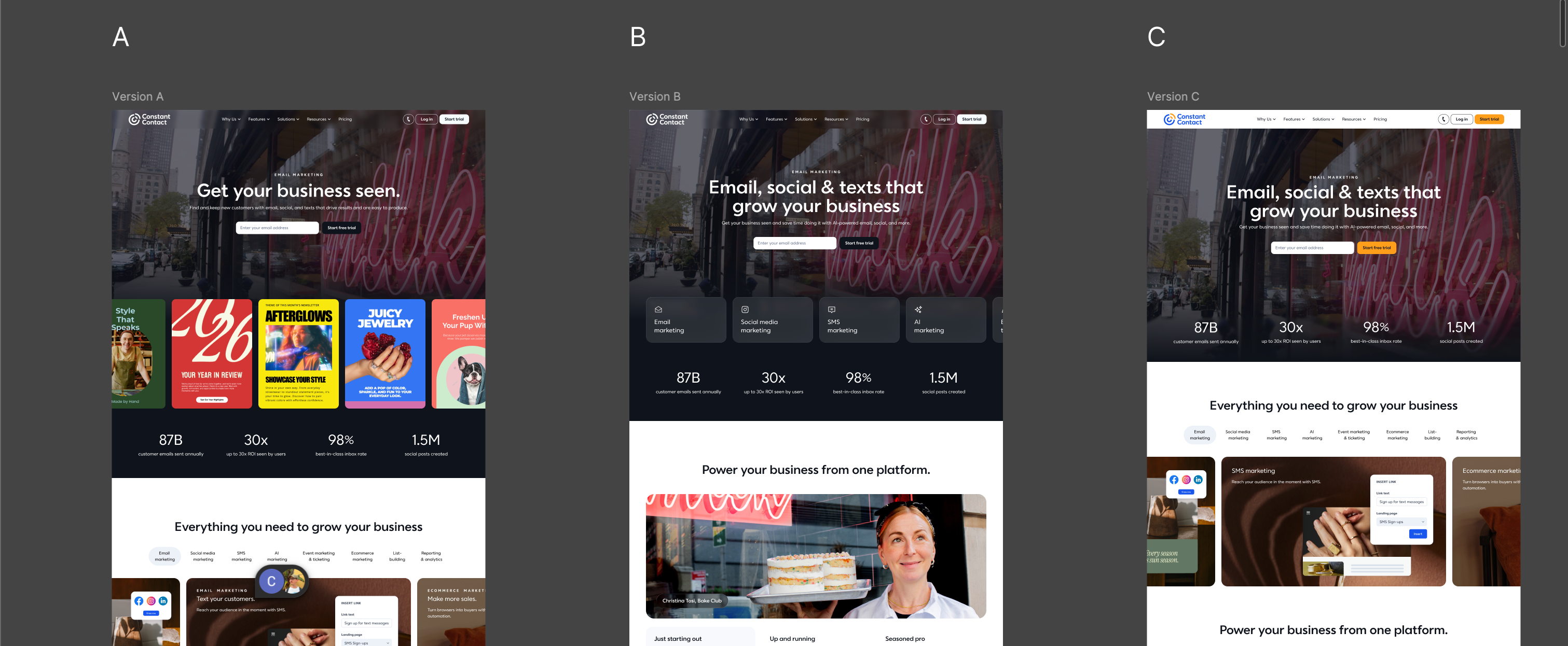
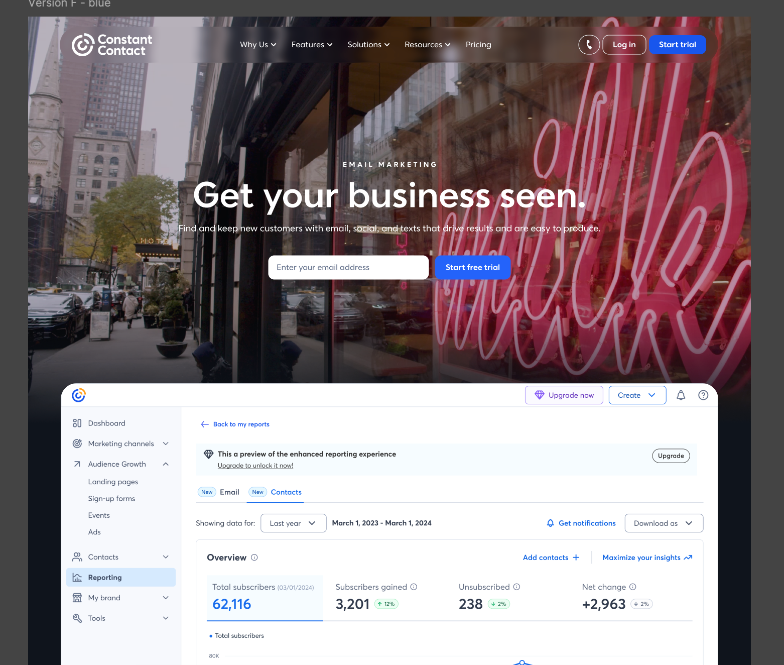
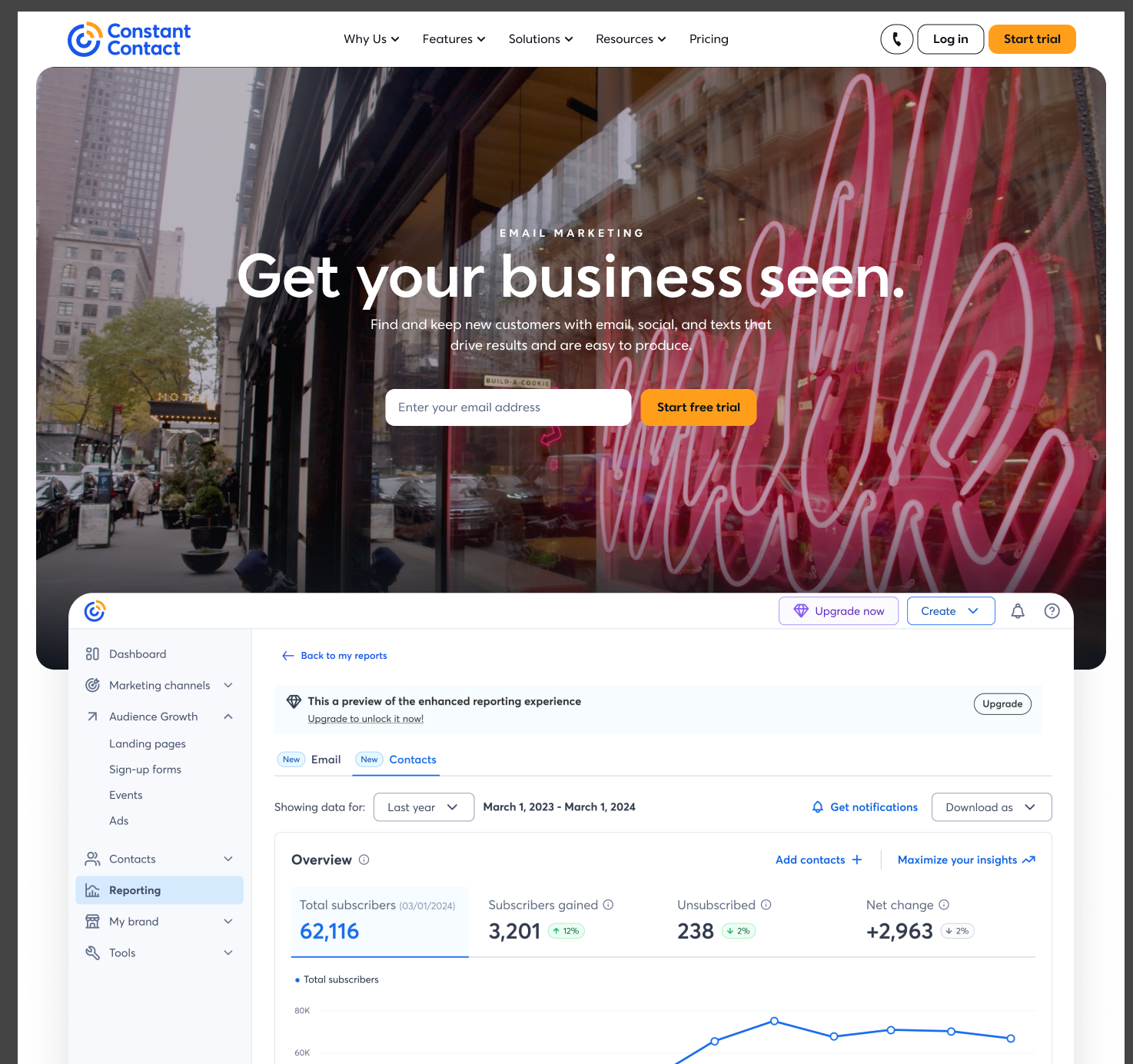
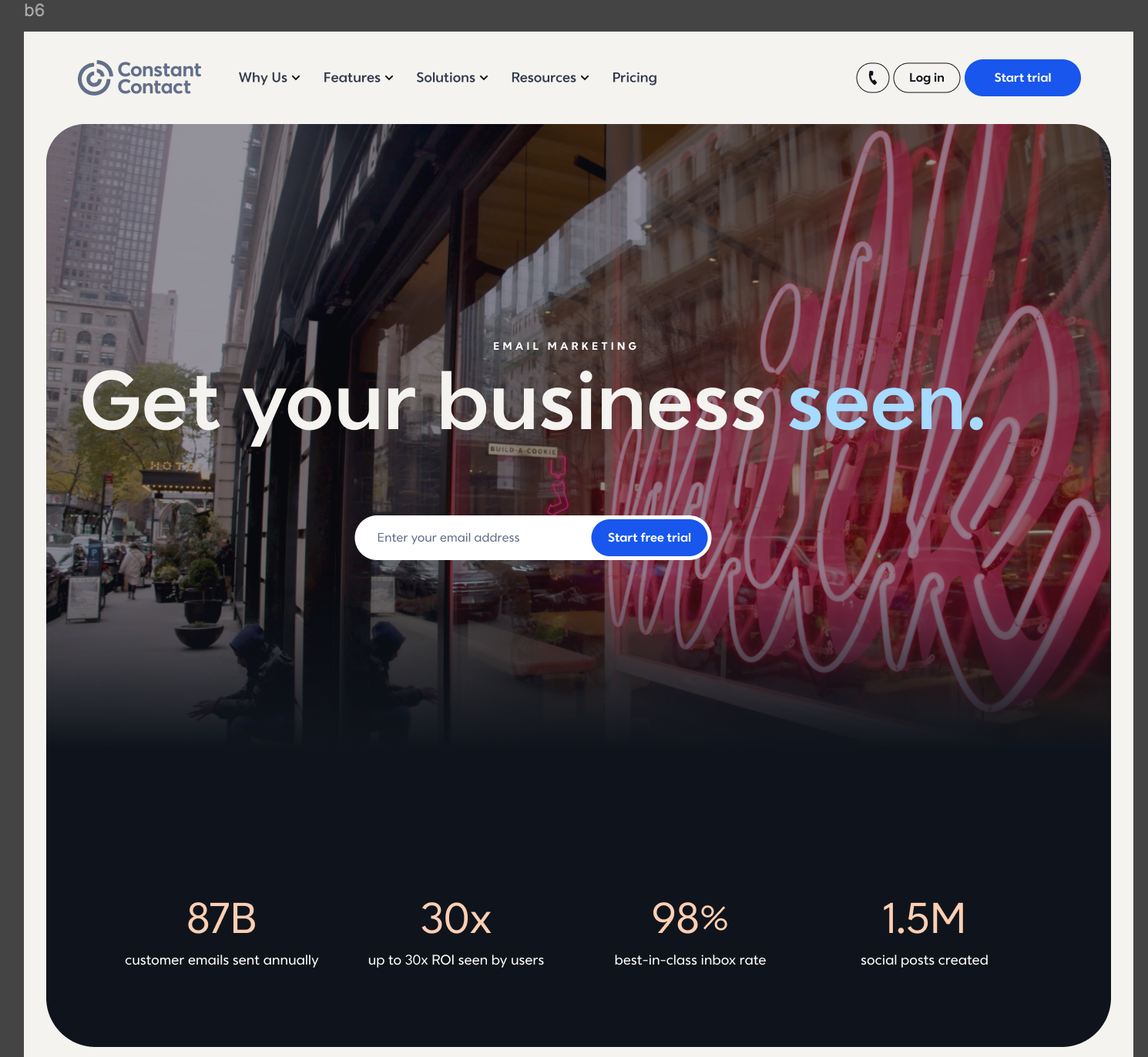
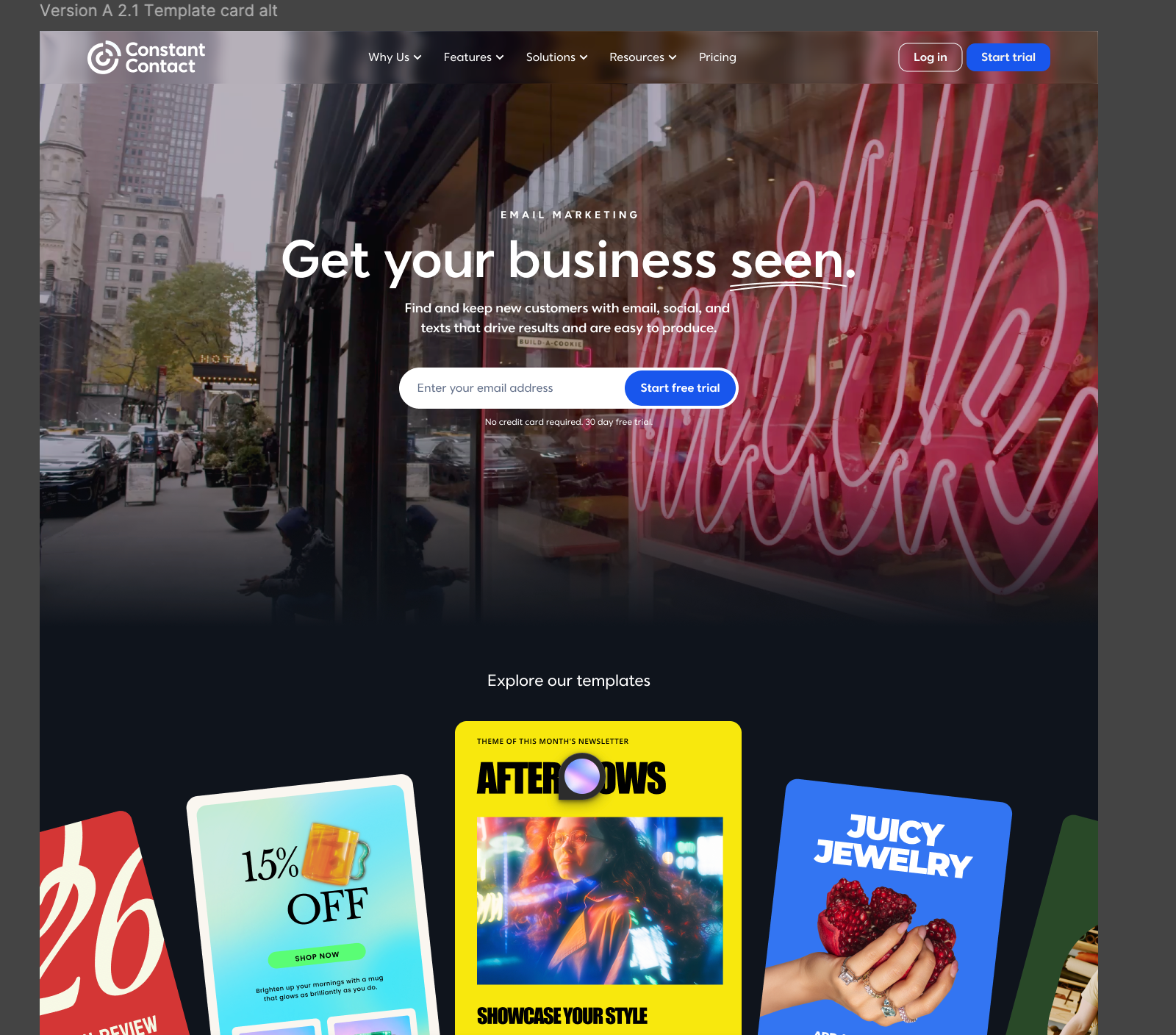
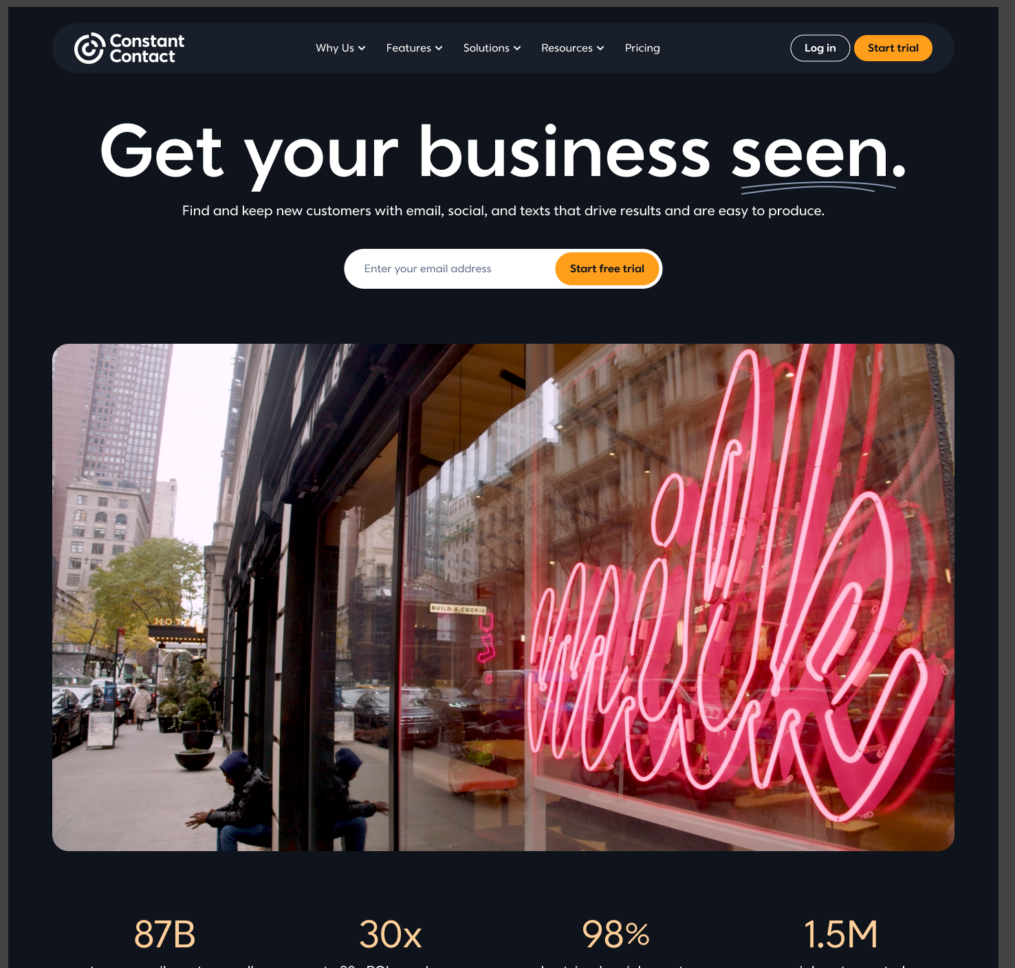
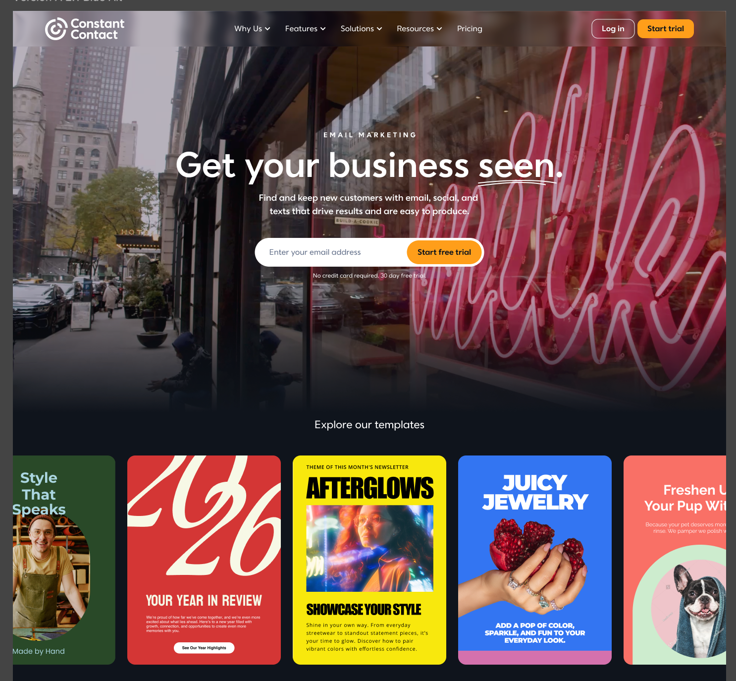
Homepage concepts explore different ways to help visitors understand the product and get started: selecting the marketing tools they need or browsing examples of what they can create.
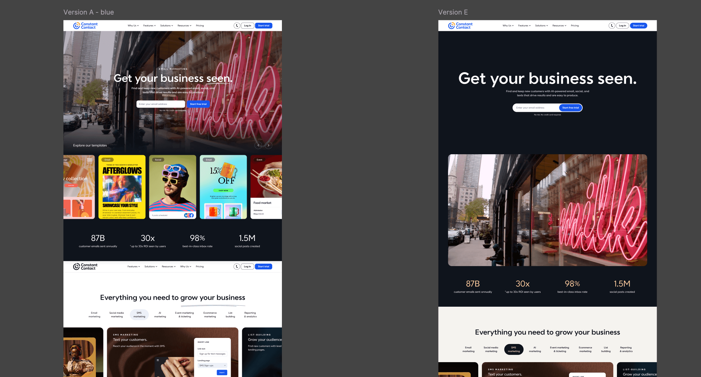
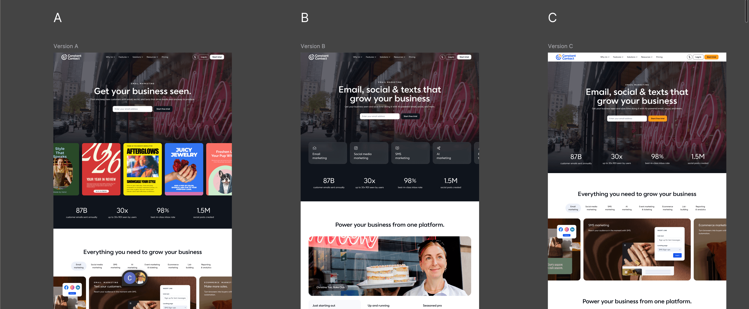
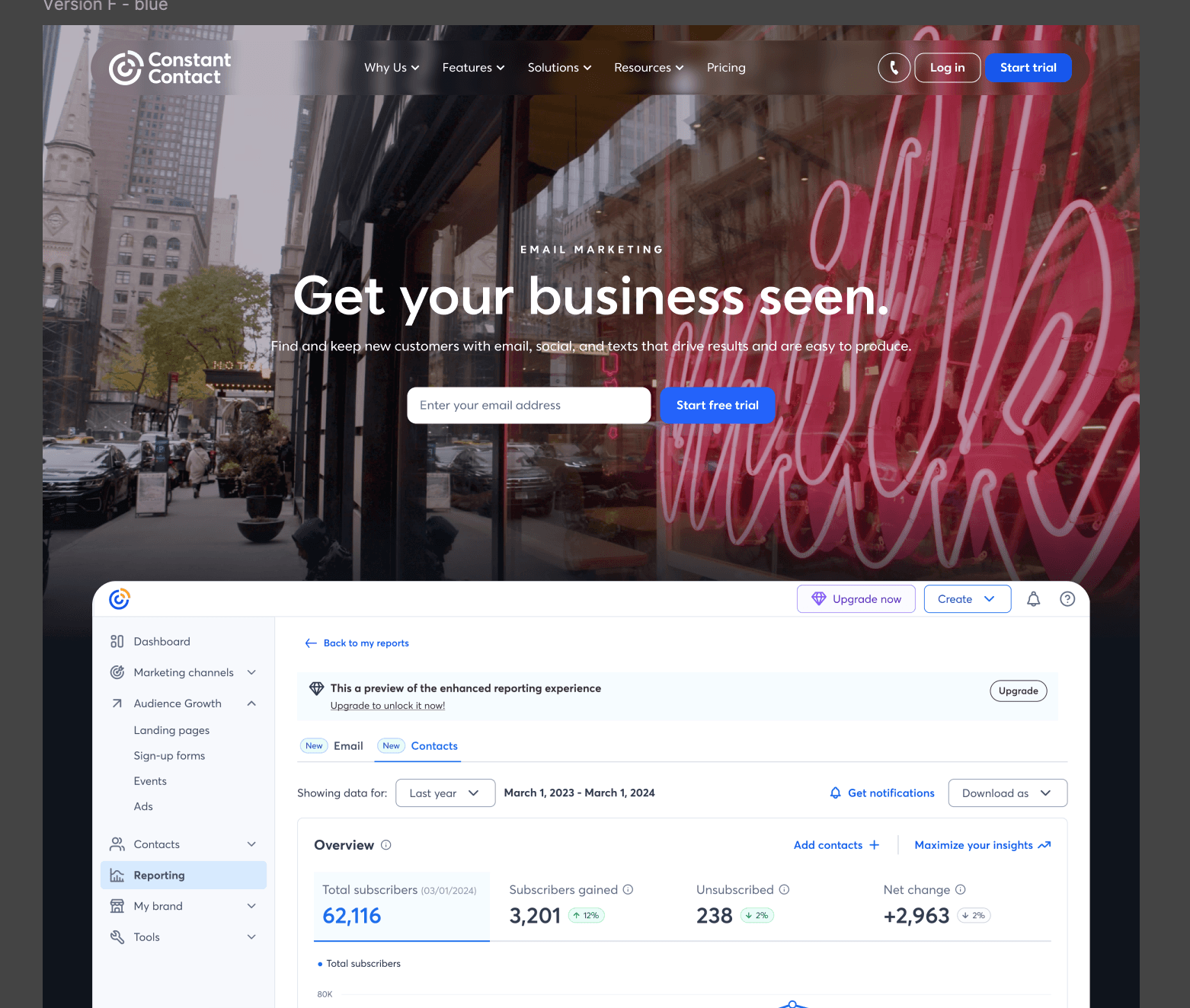
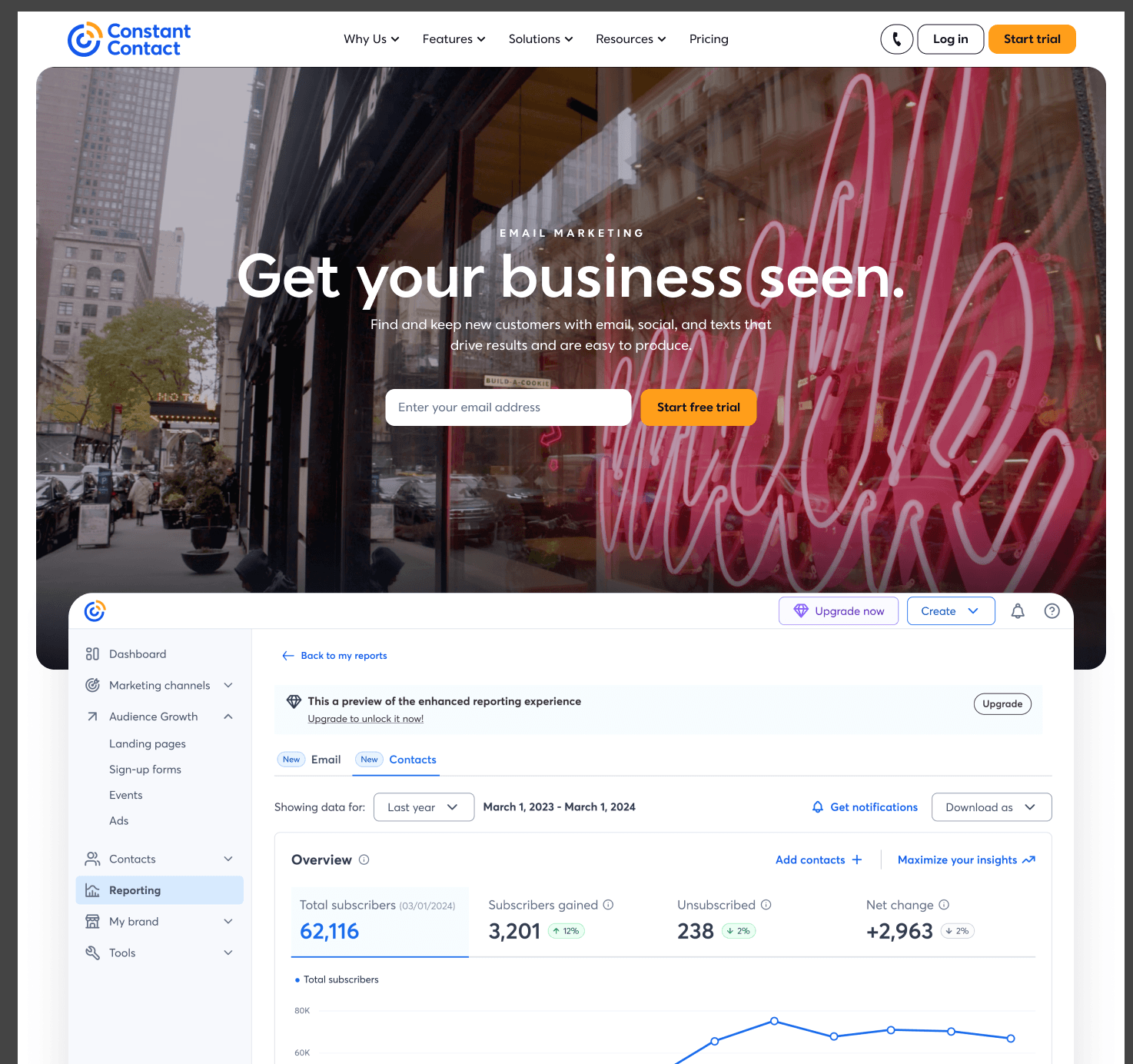
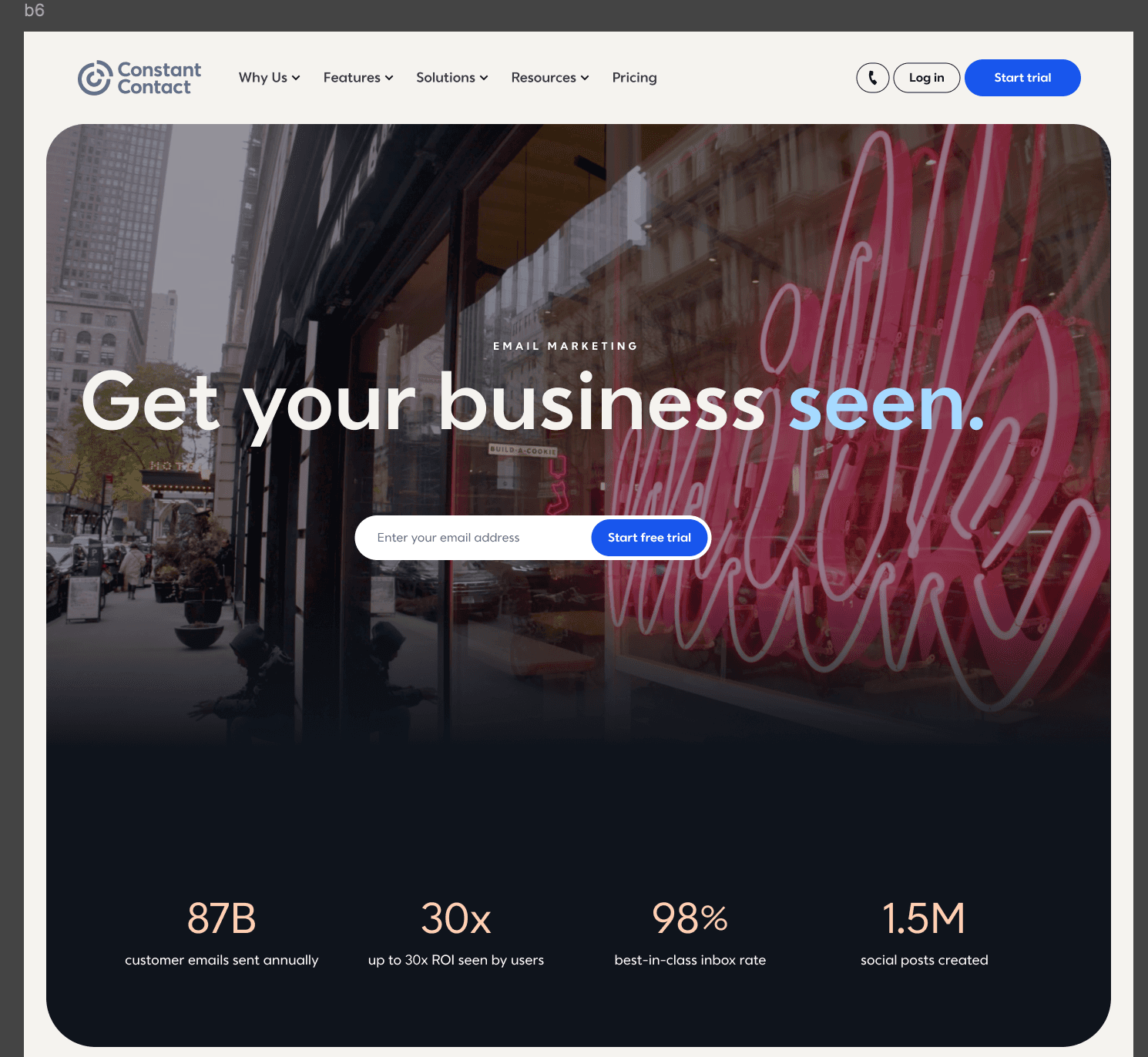
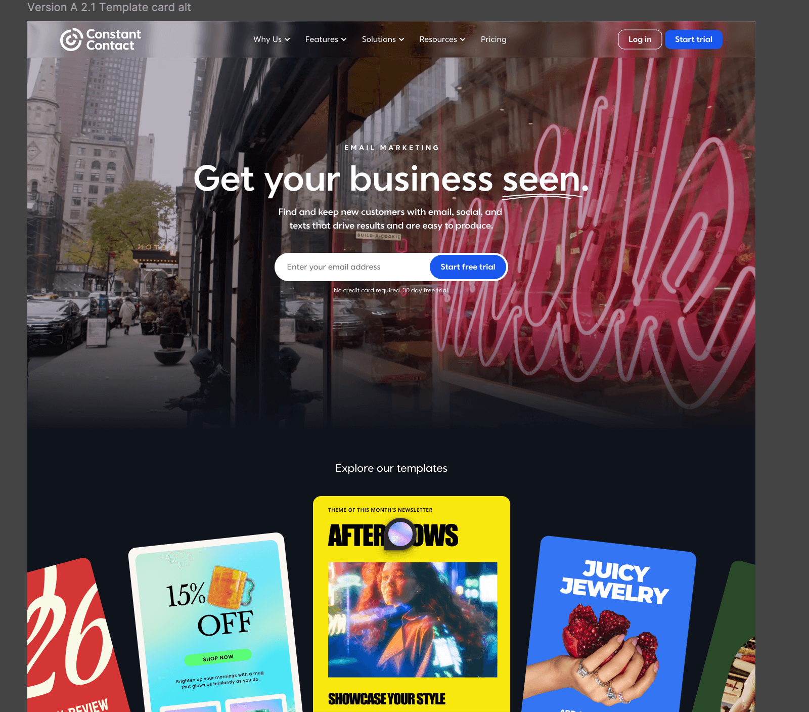
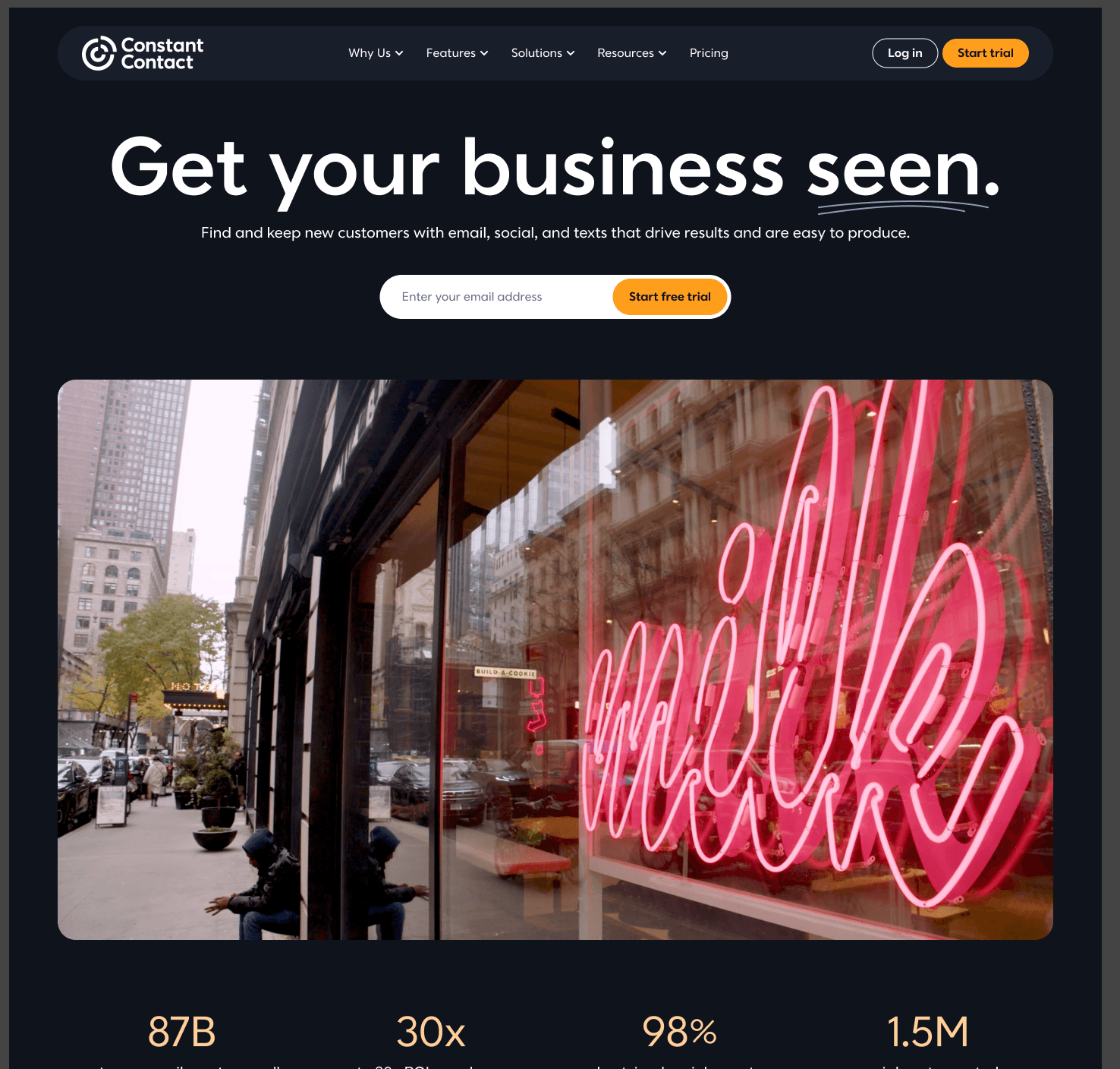
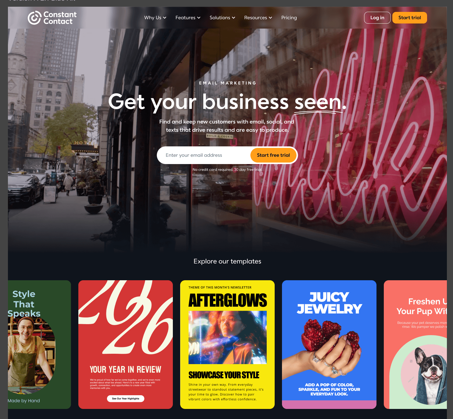
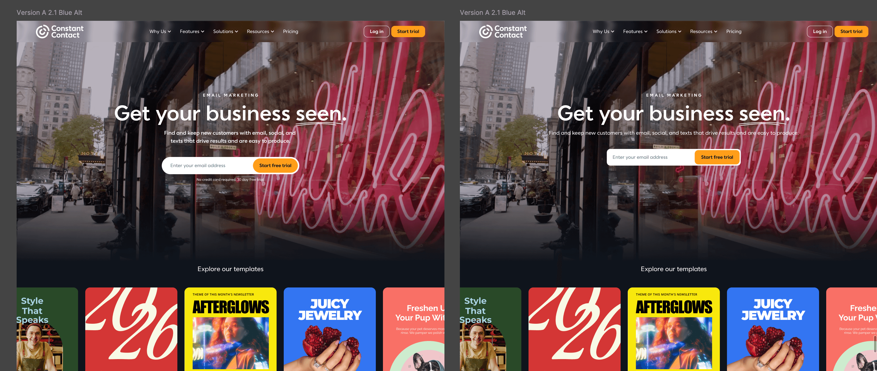
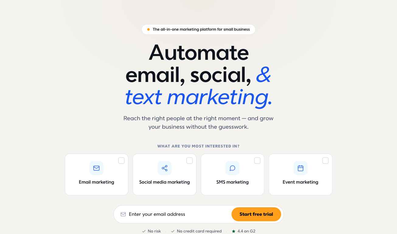
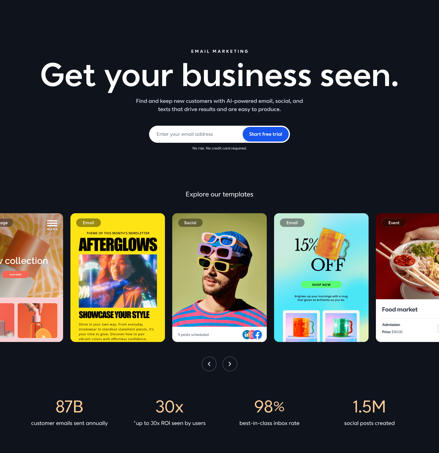
Selected concepts from the homepage design process.
02 / Website design
Make the brand useful
to the people it serves.
I started with the homepage, bringing together brand, product, and engineering to translate the refreshed identity into a working web experience. I collaborated with TBWA\Chiat\Day, design lead and engineer Blaine Levy, product manager Liz, the VP of Site, the CMO, and executive creative directors.
Homepage / Before & after
From email tool to growth partner.
The earlier homepage emphasized email marketing. The rebrand aimed to tell a broader story for entrepreneurs while keeping a clear path to start a trial.
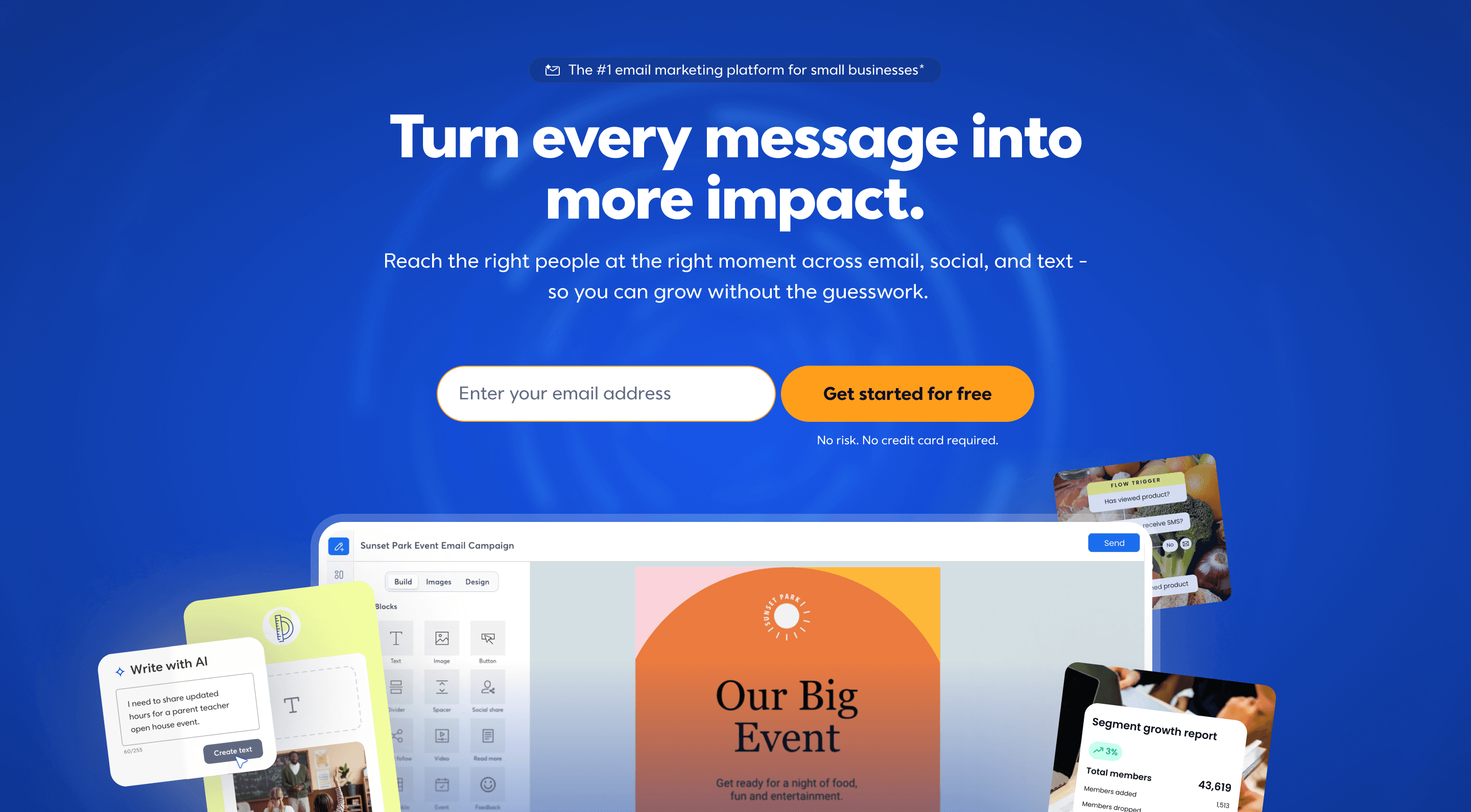
Broaden the story
Problem: The earlier positioning centered on email, while the product offered more ways to reach customers.
Response: The new headline, supporting copy, and product visuals introduced a wider set of marketing tools.
Bring the brand to life
Problem: The website needed to reflect the new identity and connect with a wider audience of entrepreneurs.
Response: The redesign introduced expressive typography, a refreshed palette, and imagery that shows the product in use.
Design for scale
Problem: A site with roughly 2,000 pages needed a consistent way to apply the new identity without relying on one-off designs.
Response: We used the homepage to establish reusable atomic components that CMS editors could apply across new pages.
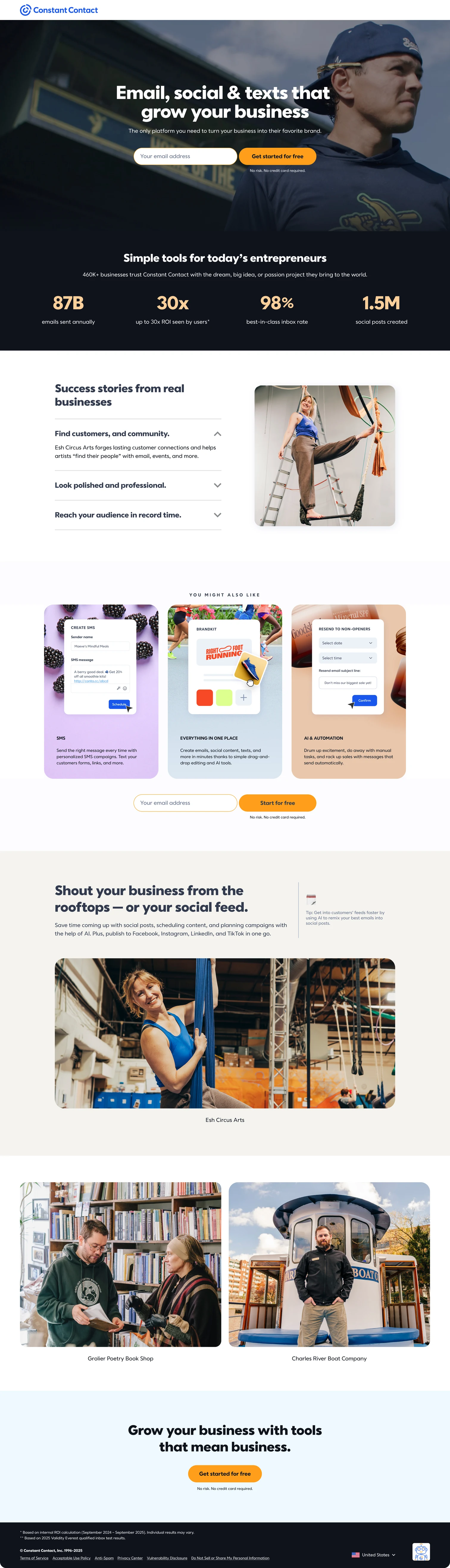
A focused landing-page experience.
A companion landing-page design shows a different arrangement of product messaging, benefits, and conversion points.

Design system
Consistency starts
with the details.
I helped create a new design system and an atomic component system, starting with the homepage. These reusable building blocks gave CMS editors a shared set of components and supported the redesign of pages across the site.
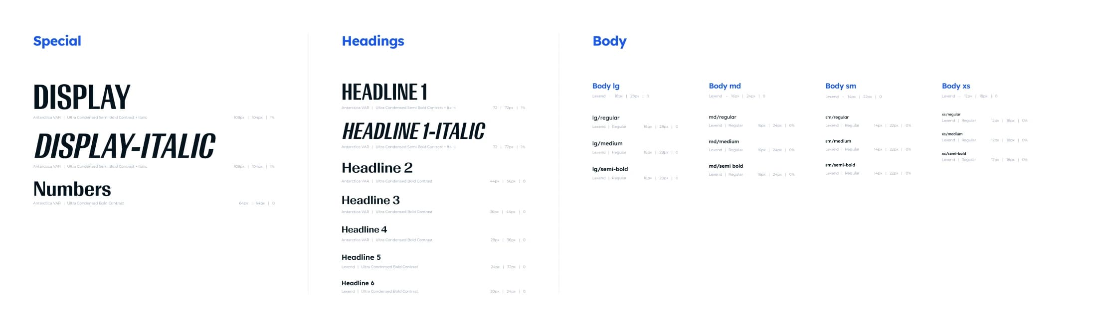
One system.
Many applications.
The system brought typography, spacing, and components together so a design decision made on the homepage could carry through to other pages.
Top-, middle-, and bottom-of-funnel landing pages drew on those homepage components, allowing editors to assemble pages from a consistent foundation.

Landing page collection
Different stories.
One connected brand.
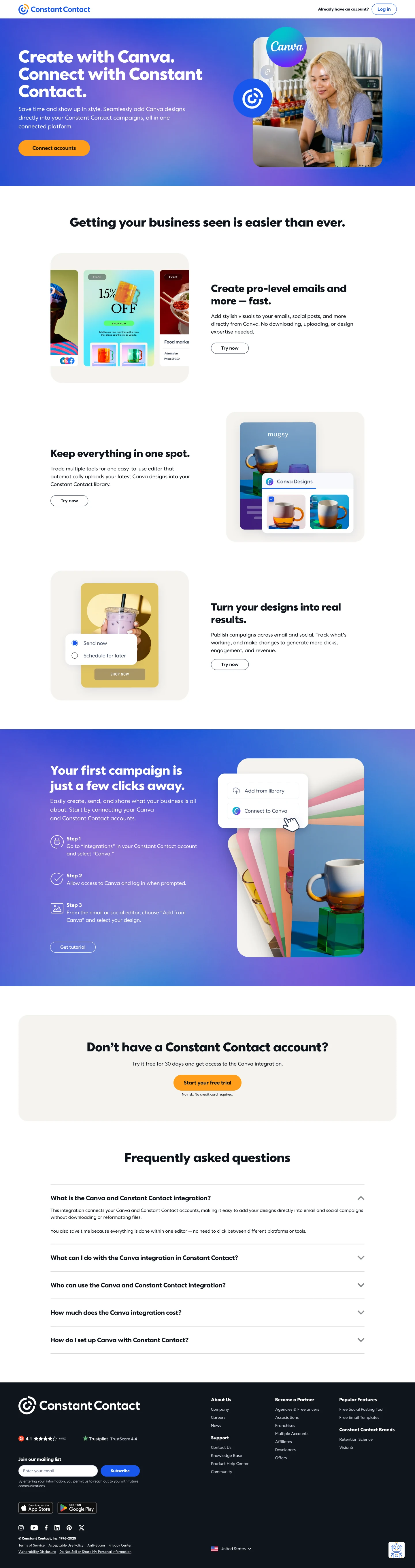
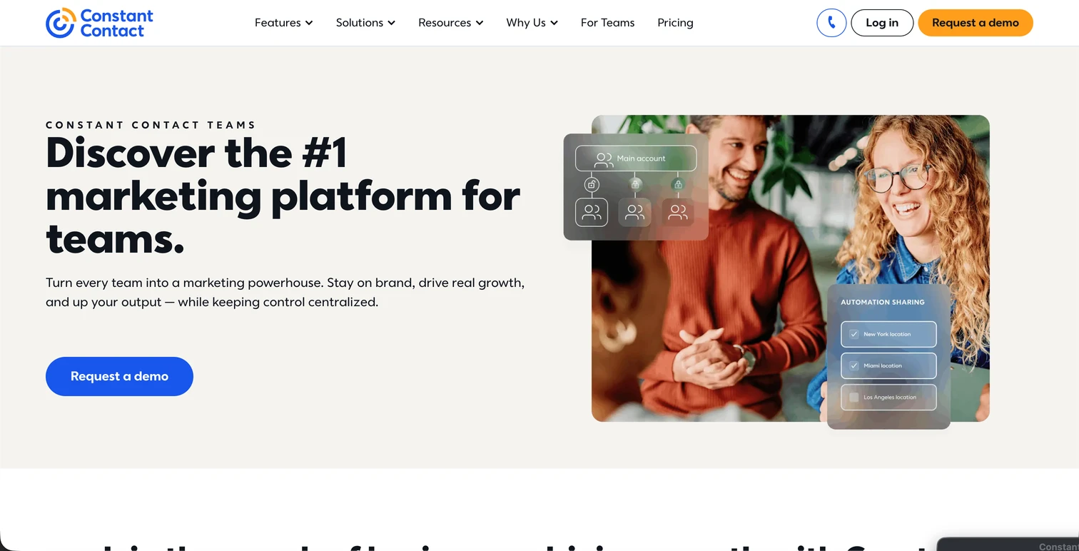
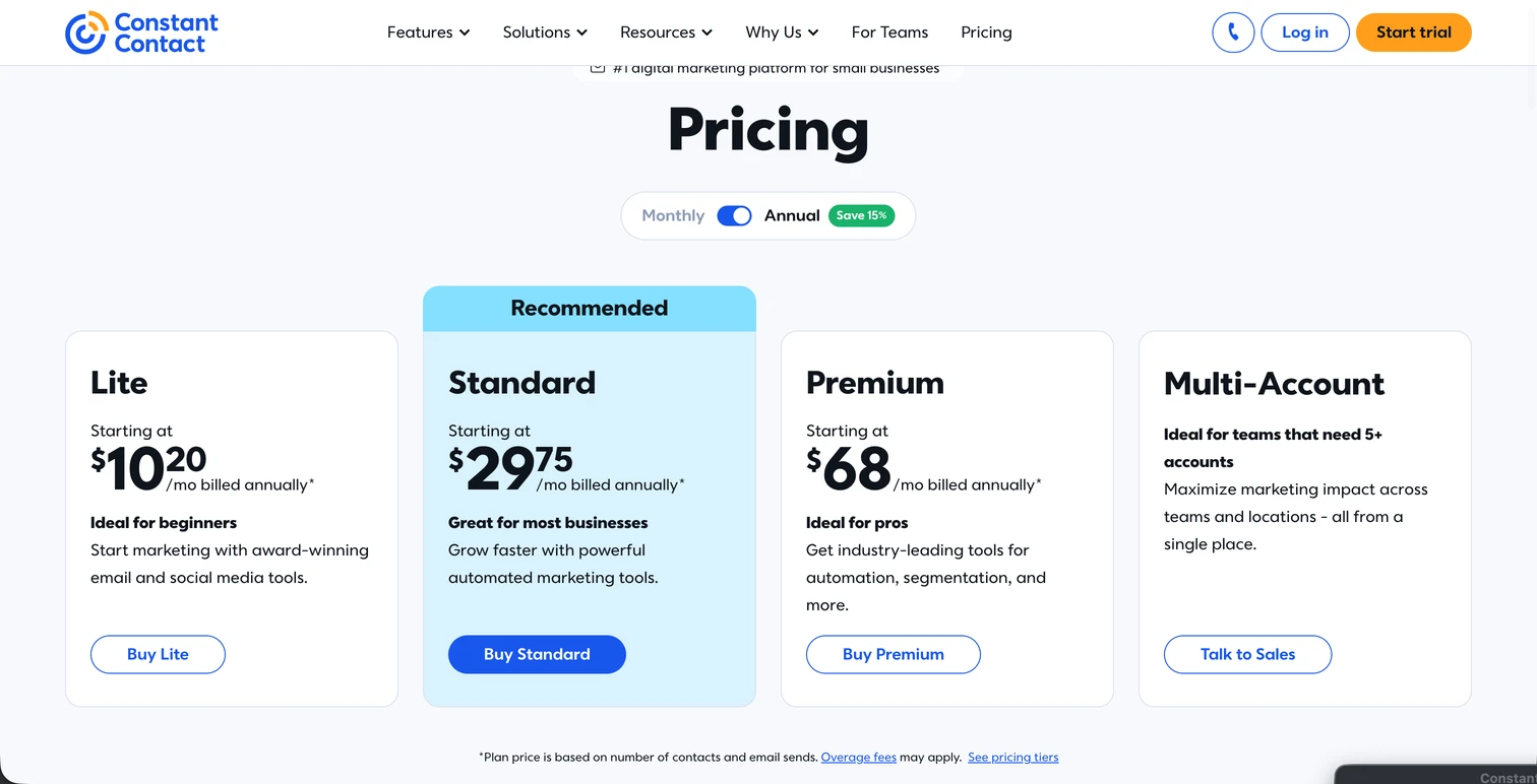
After starting with the homepage, we carried the new components into everyday page work across the funnel. These selected designs include the Canva integration, Chelsea FC Women’s Growth Locker, For Teams, and Pricing.



03 / Result
A foundation for
a growing website.
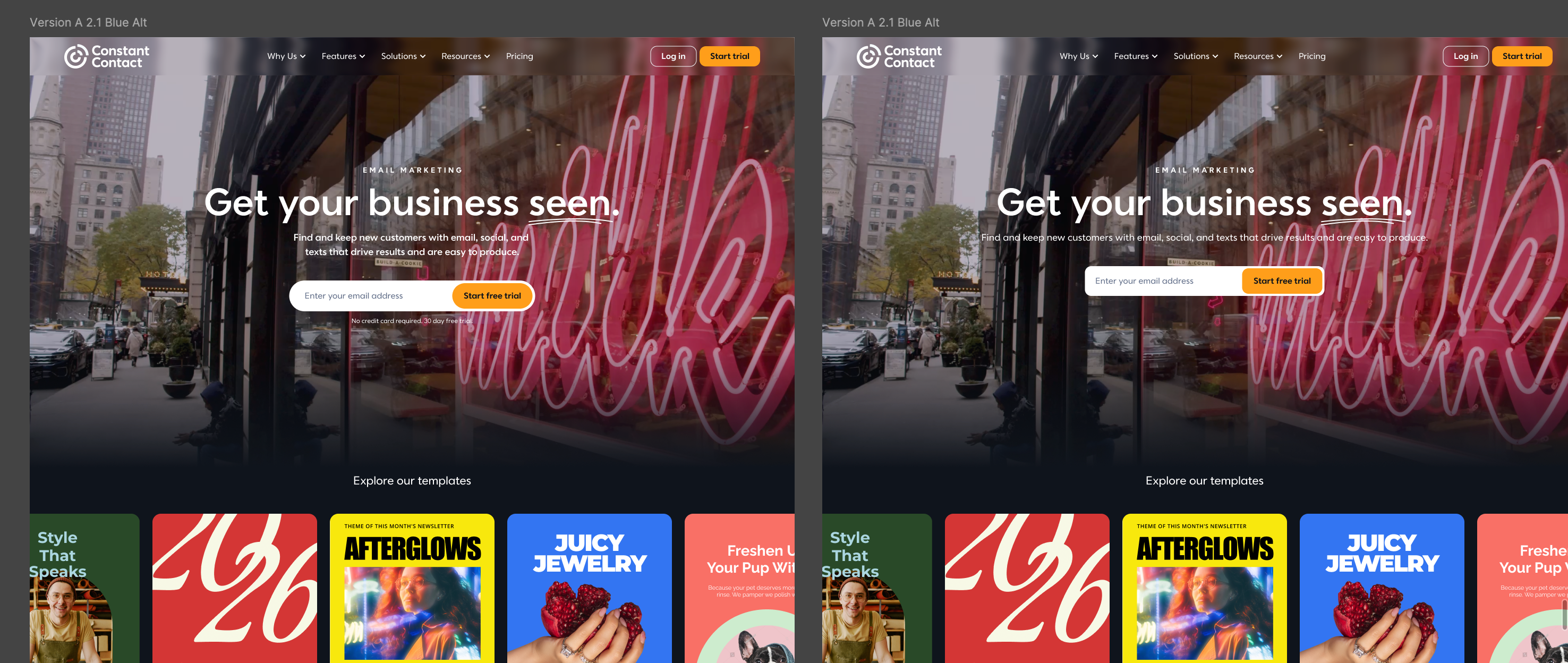
The homepage established reusable foundations for a broader site redesign. In a May 2026 homepage visual refresh test, the selected variant reported a 10.01% lift in visitor-to-trial conversion and a 7.60% lift in scroll depth; the visitor-to-trial result was reported at 90% confidence. This test preceded the later rebrand launch and does not isolate its impact.
04 / Learnings
What I’d take
into the next challenge.
This work sharpened how I approach complex, cross-functional problems: make the customer need concrete, test the most consequential decisions, and design for the people who will maintain the solution.
Build for the people behind the experience
A system succeeds when the people using it can make good decisions with it. In future projects, I’d involve designers, engineers, and content editors early, then validate components against real workflows before scaling them.
Make evidence actionable
The homepage test showed the value of comparing alternatives, while the rebrand made clear the need to separate experiment results from a broader launch. Next time, I’d agree on success measures and a post-launch measurement plan before implementation.
Align around the problem
Brand, business, and engineering partners bring different priorities. I’d use a concrete customer problem and visible tradeoffs to guide decisions, then document why we chose a direction so the team can adapt it as needs change.